

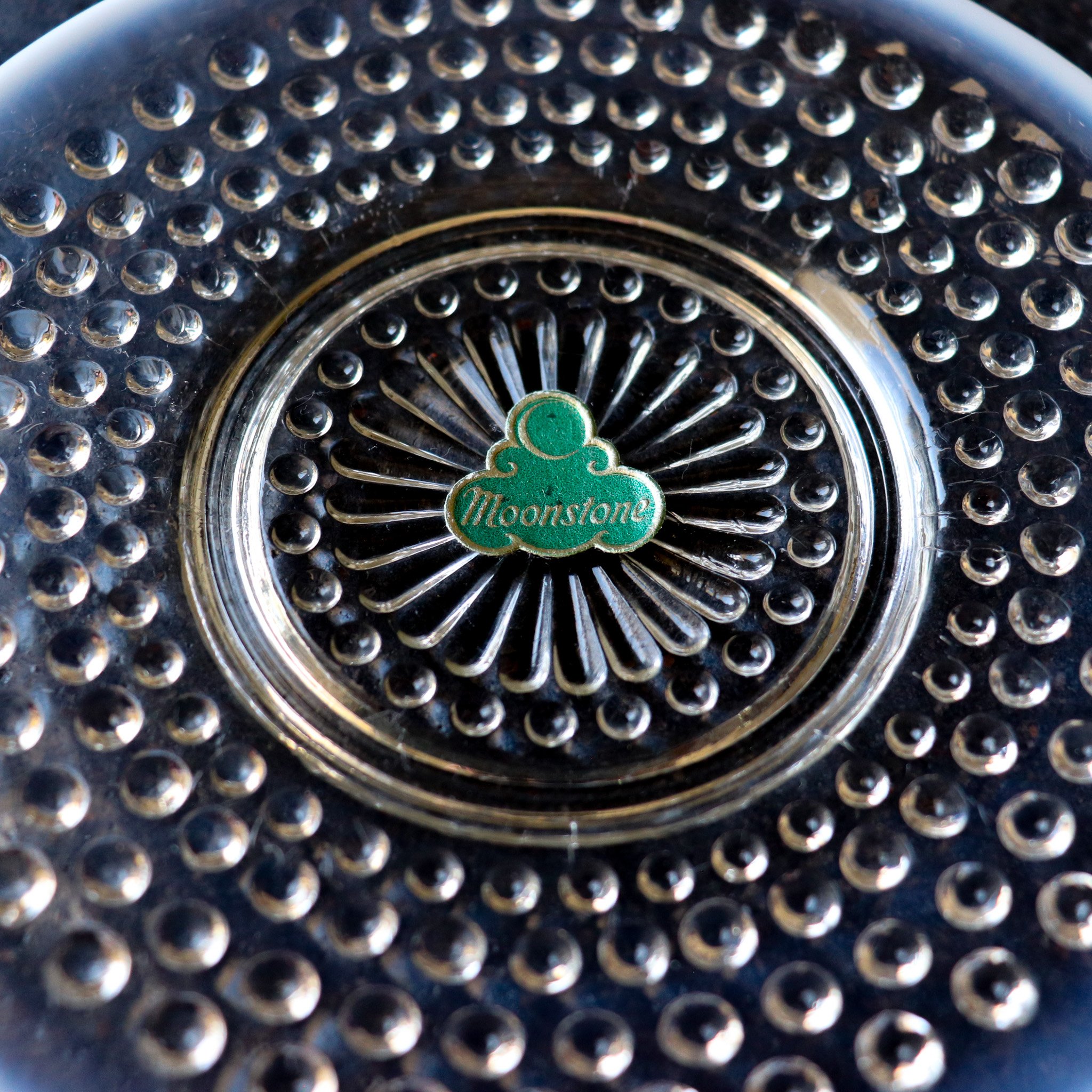
Moonstone by Anchor Hocking
Unique insights about a war-era glass production off the Anchor Hocking manufacturing lines when women were America’s primary workforce.

Anchor Hocking is one of America’s oldest glass producers, and we are delighted to receive an expansive set of mint-condition artifacts in our available collection. When discovering more about the history and creation of this set, we reached back decades farther into history than usual and found some surprises along the way.
Anchor Hocking, the glassware manufacturer we know today, has a long history. It first came into existence in 1905 when Isaac J. Collins and six friends raised $8,000 to buy the Lancaster Carbon Company in Lancaster, Ohio.
We know that Anchor Hocking did not invent Hobnail glass. We have found that the hobnail style of glass manufacture was originally produced and popularized in the Victorian Era (the Downton Abbey 1830s to about 1900). Most agree that it was developed by an artist at Hobbs Brockunier and Co. in West Virginia in 1886 by first pressing glass into a mold with hobnails all over it and then hand-blowing and shaping the piece. This early form of hobnail glassware was known as Dew Drop Glass. Sometimes the tops of the "dew drops" were made opalescent by reheating the surface of heat-sensitive glass near the furnace, aka "glory hole." It was commonly made into pitchers with matching drinking glasses for elegant ladies' luncheons and picnics.
Anchor Hocking moonstone original sticker circa 1942-1946
Nearly 100 years later, during the great depression, Hocking set out to democratize the dew drop glass style and introduce hobnail to Americans outside of high society. Bright colors like pink, clear with red trim, and some pieces in ruby were providing a sense of luxury and cheer in hard economic times. It was nearly 10 years after they began producing hobnail glass that they began manufacturing their own Moonstone opalescent hobnail glass. This decade was needed for Anchor Hocking to develop a way to mass manufacture that elusive opalescent tipped look. A triumph in American manufacturing, the first pieces of Moonstone arrived in 1942, just after we marked the end of the Depression and the beginning of WW2.
With the war on an upswing, a large majority of American men were drafted to serve, and the remaining workforce was primarily comprised of women. It is not a far stretch to imagine that the hands that worked the glass pressing machines would have been women, quite a different scenario to the pink pieces manufactured just a decade earlier. These pieces are from an era prior to the significant post-war economic and style shift.

Anchor Hocking ruffled edge Moonstone Bowl and Dinner Plate circa 1940s
The Moonstone pattern, made from hobnail molds, features primarily transparent glass bodies with white opalescent glass highlights on the tips of the hobs and edges of each piece, sometimes reflecting shades of blue or amethyst. It took many forms, from traditional dinnerware pieces like plates and cups to impressive serveware, accessories, and table decor. Several of these pearlescent pieces, especially the tableware, host hyperfeminine ruffled edges, making for a striking display when a place setting is stacked. As was popular in the era, several serving pieces were divided to carry several small treats, and it was common for use with sweet and savory offerings. Large punch bowls were made for social gatherings, and though it was a century after the first hobnails came to be, elegant ladies still used matching pitchers and drinking glasses for luncheons and picnics. This time, though, they were catching daylight on their tables in the twinking opalescent glow of Moonstone.
Hocking continued production through 1946. A short run, making these particular pieces rare and collectible.

Opalescent hue shows and glows with different angles and light.
Artist Highlight: Jim McBride
Learn about the timeless forms and impeccable hand-finished construction of 1970s Fabrik by Jim McBride designs, why they are synonymous with the Pacific Northwest, and why they continue to charm dinner guests across the country.

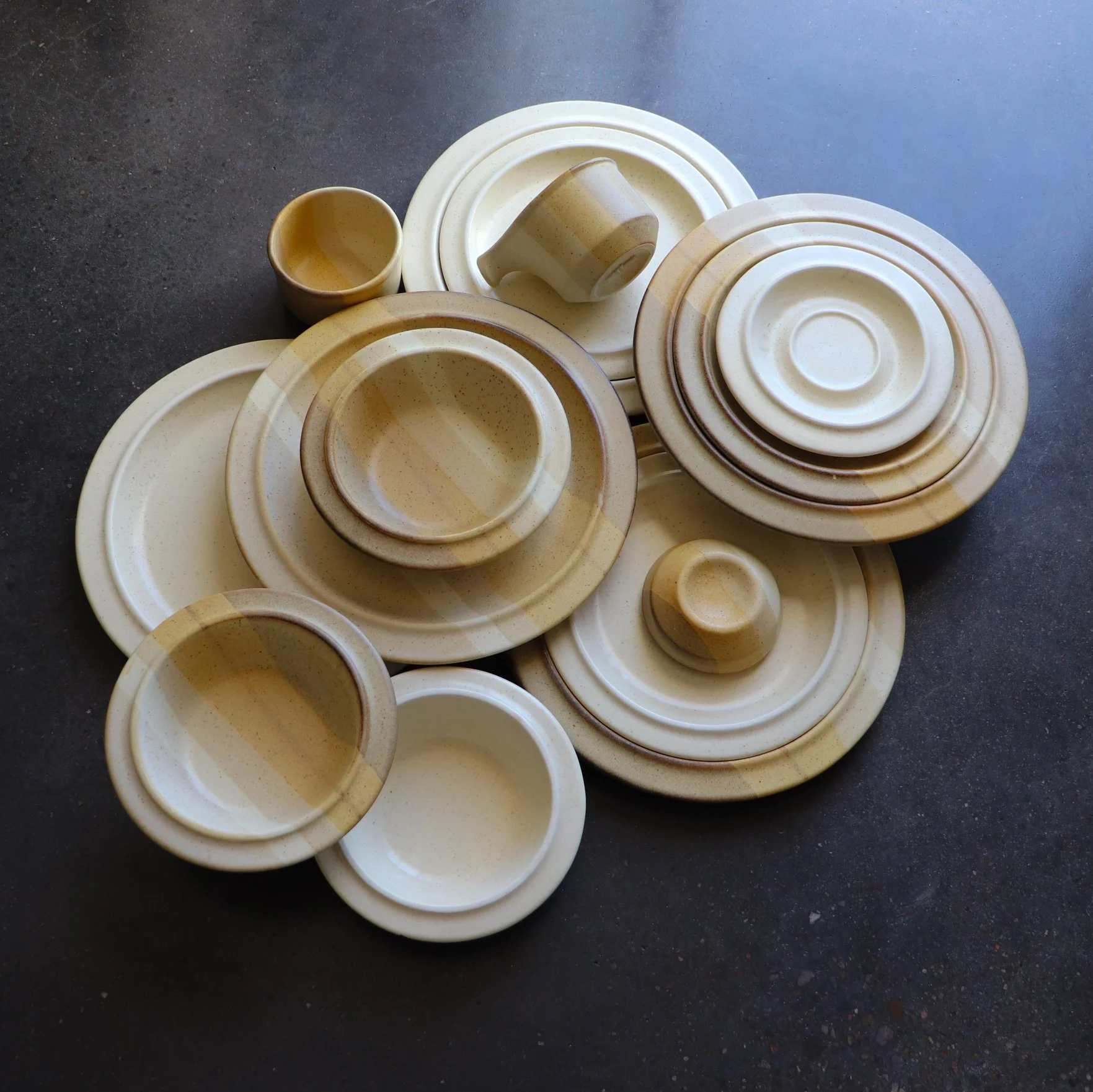
Salishan and Ptarmigan pattern dinnerware circa 1970s.
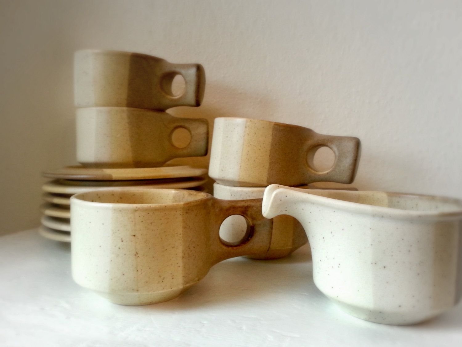
Salishan cups, saucers and creamer designed by Jim McBride for Fabrik.
While working as a pottery apprentice at Pottery Northwest, Jim McBride dreamed of opening his own factory. In the 1970s, he saved up enough money to purchase some secondhand mass-production equipment and opened his own doors under the name Fabrik at 701 6th Avenue, North Seattle, Washington.
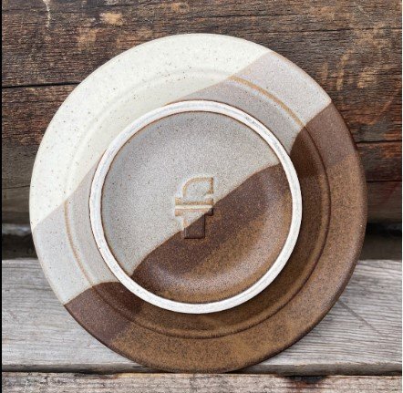
Jim developed a distinctive dinnerware line, including plates, cups, and some serving pieces. The pieces are heavy, molded, and glazed with smooth matte finishes in simple overlap/interface patterns in varying combinations of earth tones. The hand-crafted work is known for its ram-pressed clay construction, outward slanted rims, and unusual handles. Plates stack into each other, creating a space-age flying saucer silhouette; salt and pepper sets are sculptural blocks with perfectly circular center-punched holes that pair nicely with the perfectly circular handles on the tea and coffee cups.
The artisan pieces are thick, substantial, and highly striking yet made to endure daily use and provide functionality to the modern home of the 1970s. Every piece was manufactured to be used in the oven, table, freezer, or microwave.
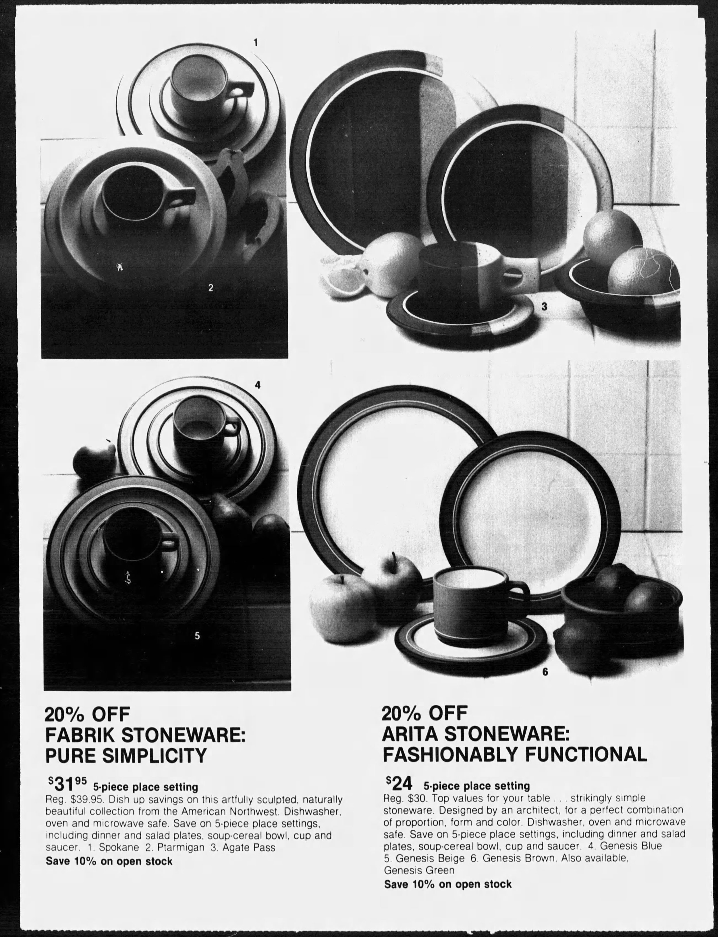
September 7th, 1980. Chicago Tribune.
To celebrate the home pride of the man and the company, all of the colorway names were regionally inspired.
Agate Pass; a high-current tidal strait in Puget Sound connecting Port Madison and mainland Kitsap County in Washington.
Verticle tri-color dipped design in deep brown, gray, and buff.
Salishan; a tribe indigenous to the PNW.
Vertical stripe in buff, cream, and beige.
Spokane; The name “Spokane” is often translated as “children of the sun,” most likely stemming from the name of a chief, Illim-Spokanee, first encountered by fur traders, whose name was translated as “Son of the Sun”. Spokane is now the name of a town 4 hours outside of Seattle.
Buff with brown fleck surface and brown banding.
Ptarmigan; A bird found in the Cascades from Wahstington’s Mt. Adams north to the U.S.-Canada border.
Plain body with brown flecks.
Foxfire; the phosphorescent light emitted by certain fungi on decaying timber.
Verticle stripe in grey, beige, and sandstone pink.
The company did manufacture custom work and some limited colorways, so some rare-to-find pieces are out there. Some known short-run colors of the original Agate pass vertical stripe designs are known to exist in raspberry and dusty pink, and in navy and cornflower blue. We also see a version of Ptarmigan in a brown body with speckles.
The unique style was met with great appreciation, and at its height, Fabrik could employ more than 15 artists to manufacture pieces for distribution nationwide. We know that there was a waterfront restaurant featuring Jim’s pottery near the factory and that The Bon’s in Southcenter’s china and gift department offered children’s own hands to be printed permanently on the stoneware to be hand finished and hand glazed for pick up as personal keepsakes in time for Fathers Day. Several shops provided Fabrik designs for wedding registries.

The raised “F” signature makers mark is found on the bottom of every Fabrik piece.
Fabrik logo on the underside of an Agate Pass pattern saucer.
Fabrik pieces appear in boutique catalogs and advertisements, which are heavily concentrated in the Pacific Northwest but also highlighted in a few key areas across the country. Regionally, they sold at The Country Corner in The Marketplace in Fairhaven Village. We also see Fabrik sold at all of The Bons locations. In Washington, we see Bon’s ads in Tacoma Mall, Bellingham, and Southcenter. Bon’s had locations throughout Montana, including cities like Missoula and Great Falls. Bon’s also listed Fabrik in Coos Bay, Oregon, and in Twin Falls and Boise, Idaho.
For cities outside of the PNW, we see several ads for Fabrik concentrated in the West but reaching key locations as far as the East Coast. In the West, we see listings at American Furniture and Jans Pan-tree in Albuquerque, New Mexico; La Boutique in Carlsbad, New Mexico; Tabletop in Tuscon, Arizona; and several Macy’s in Northern California. In middle America, we see listings for Yes, Virginia in Bismark, North Dakota; Marshall Fields in Chicago; Ben Simon’s in Omaha, Nebraska and Bin & Barrel, Corpus Christi, Texas. In the East, we see Elegant Accents in Tampa, Florida, and Scan Design at the Carriage Gate Center in Tallahassee, Florida. This is not a comprehensive list of locations where Fabrik was distributed but it gives collectors an idea of where to look to find more pieces by Jim McBride.

Concentration of known Fabrik ads published throughout history.

May 9th, 1975. The Bellingham Herald. Mary McBride makes an in store appearance.
After flourishing for many years, the Fabrik factory lost its way in the early 80s when Jim and his wife Mary, who had been running the business together, filed for divorce. Jim started experimenting with a bold new direction which did not resonate with customers. During this time, Jim created the unappealing American Quilt Collection (1984), whose name refers to a vibrant patchwork of different cultural and ethnic pockets residing within a larger community. It was the only colorway name that was not explicitly representative of the PNW. The collection was buff white with center-stamped navy blue geometric motifs and thin blue banding. Some of the newly developed pieces were unimaginative and tastelessly ornamented with handpainted words. The business rapidly deteriorated to the point of bankruptcy and officially shut its doors in the mid-1980s.

September 12th, 1982. The Journal Times. Ad for American Quilt by Fabrik.
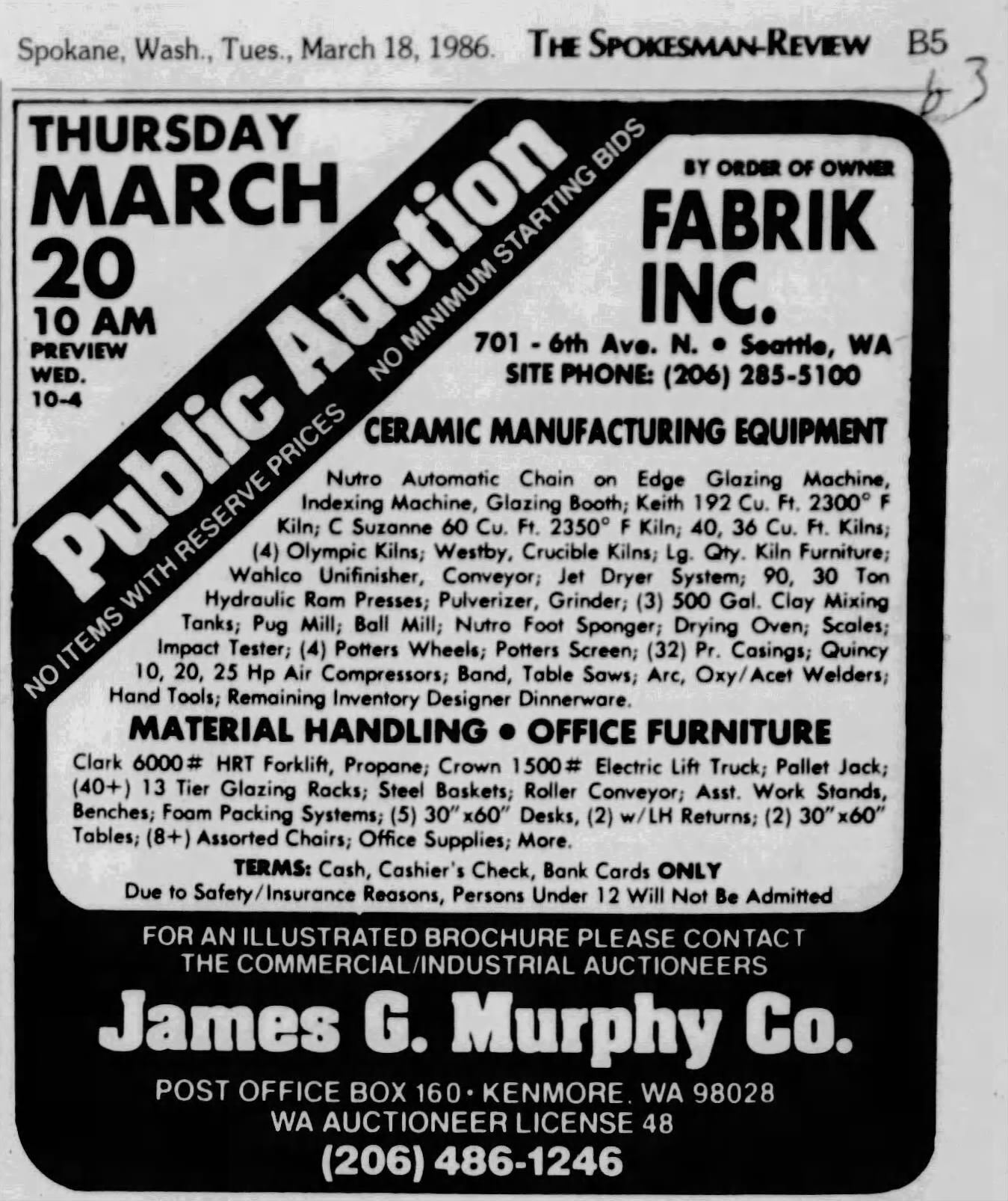
We found the public auction advertisement from James G. Murphy Co. listed in the Spokesman-Review (Spokane, Washington) on March 18th, 1986. The listing provided details on the auction's contents as Fabrik cleared its operation. The auction included ceramic manufacturing equipment, everything from glazing machines to industrial kilns, hydraulic ram presses, pottery wheels, pulverizers, table saws, and the remaining dinnerware inventory. There is a potential that the purchaser of the remaining inventory and original molds tried to continue the brand. In a 1990s message board, one woman mentioned that she discovered a Fabrik website not managed by McBride on a search engine. This, of course, has long disappeared, so clearly, they had no success in continuing the Fabrik legacy.

Example of American Quilt by Fabrik circa 1980s.
Today, the timeless forms and impeccable hand-finished construction of the original 1970s Fabrik by Jim McBride designs are a favorite in functional mid-century collectibles. They are synonymous with Pacific Northwest mid-century design and continue to charm dinner guests across the country.

Why Vintage Glassware is Bursting with Vibrant Colors
In the past, glassmakers utilized various techniques to infuse colors into their creations.

Have you ever wondered why vintage glassware is bursting with vibrant colors while modern-day glassware tends to be mostly clear? 🤔 Let's explore the fascinating reasons behind this shift.
In the past, glassmakers utilized various techniques to infuse colors into their creations. They incorporated vibrant pigments like manganese, cobalt, uranium, and even gold during the glassblowing process. These elements created stunning hues, ranging from rich blues and greens to radiant reds and yellows. Vintage glassware truly reflected the creativity and craftsmanship of the artisans behind them.
However, as time went on, the demand for clear glassware increased.
Clear glassware gained popularity due to its versatility. It allowed the colors of the fine wines to take center stage and became preferred for formal occasions and fine dining.

Technological advancements played the most significant role. Developing more transparent glass formulas and refining production techniques made it easier to mass-produce clear glassware. This resulted in cost-effective (cheap!) manufacturing processes and broader availability for consumers.

Still, the allure of mouth-blown vintage glassware remains unparalleled. Especially if you already know the color of your favorite chard pretty damn well. The vivid colors found in vintage pieces add a touch of nostalgia and personality to any table setting. They evoke a sense of history and are cherished as collectibles, reminding us of the unique craftsmanship and design aesthetics of bygone eras and artists.
Raise a toast to the colorful past and the clear future of glassware! 🥂✨

Ceramicist Rupert Deese
From B-17 mechanic to renowned ceramist: Rupert Deese's journey from military service to museum collections.

Rupert Deese and Madeira, one of his many collections for Franciscan.
Rupert Deese was born in Agana, Guam, where his father served as a Marine Corps officer. After graduation from high school in 1942, he enlisted in the Army Air Corps, serving stateside as a B-17 mechanic. Deese graduated with a Bachelor of Arts degree in 1950 from Pomona College. After graduation, he started working as a ceramist in Claremont, California.
In the mid-fifties, supported by a grant from local art patrons Robert and Catherine Garrison, Deese entered Claremont Graduate School, studying ceramics.
After receiving his Master of Fine Arts in ceramics in 1957, Deese continued making his own ceramics in his studio. However, like many artists, he found it necessary to supplement his income. After graduation, he began teaching ceramics at Mt. San Antonio College in Walnut, California, and remained on the faculty until 1971.
Deese's pottery gained national recognition in 1960 when his covered bean jar won the IBM sweepstakes prize at the prestigious 21st Ceramic National Exhibition at the Everson Museum in Syracuse, New York.
In 1964, Deese accepted a full-time position as a designer in the Franciscan Ceramics division of Interpace (International Pipe and Ceramics Corporation) in Los Angeles.
For the next twenty years until his retirement in 1984, Deese created shapes and patterns for Franciscan dinnerware, glassware, and flatware. In the evenings and on weekends, he continued to work on his own ceramics in his Padua Hills Claremont studio.
Deese created numerous custom pieces, including a United States Capitol Members' Dining Room planter. His work can be seen in several prestigious museum collections, including the LACMA in California and the Museum of Fine Arts in Boston.

Exploring the Durability of 1960s and 70s Stoneware Dinnerware
Discover why stoneware dinnerware from the 1960s and 70s is renowned for its durability and practicality.
Several patterns and shapes of 1960s and 1970s dinnerware
Stoneware dinnerware of the 1960s and 70s is well-known for its durability and longevity. This type of dinnerware is made from clay that has been fired at high temperatures, making it resistant to chips, cracks, and scratches. But what makes stoneware dinnerware from this era so durable compared to other types of dinnerware?
First, we must explore the unique cultural shifts happening around the dinner table at the time because, in many ways, this was the driving force behind many of the changes occurring in the market. By the 1960s and 70s, newer technologies like the microwave oven and the automatic dishwashing machine were commonplace. This encouraged dinnerware manufacturers to innovate as young households ditched mother and grandmother’s delicate porcelains with silver and gold embellishments that could not be microwaved. Another thing to consider is the number of women who had entered the workforce by this time. It was common for children old enough to spend a few after-school hours at home alone. People wanted their kitchens to revolve around ease with minimal clean-up, which introduced an era of extra durable oven-to-table-to-freezer pieces.
So, what technologies and changes were made to accommodate the modern family of the 1960s and 70s? Well, several.
One reason vintage stoneware is seemingly everlasting is the quality of the clay used. Stoneware clay is naturally more durable than other types of clay because it has a higher firing temperature, which makes it harder and less porous. The stoneware clay used in the 1960s and 70s was typically of a high quality compared to today’s. It was fired at high temperatures, which resulted in a stronger and more durable final product.

1970s Stoneware dinnerware designed by Jim McBride in Seattle for his company Fabrik
Another reason for the durability of stoneware dinnerware from this era is the glazes used. Glazes are applied to the surface of the stoneware to make it smooth and waterproof and to add color and design. The glazes used on stoneware dinnerware of the 1960s and 70s are high-quality, with a focus on withstanding both machine dishwashing and several blasts of 1970s-strength microwave radiation. This particular attention to glazes meant they were less likely to chip, crack, or craze. Crazing is a spiderlike cracking to glazing, which is not structural damage (makes it more susceptible) but can leave spaces for mold and harmful bacteria to fester. You see this a lot in pre-60s dinnerware.
Additionally, stoneware dinnerware from this era was often thicker and heavier than other types of dinnerware, which added to its durability. Though this was primarily an aesthetic choice of the era to emulate a back-to-nature rustic feel, the weight and thickness of the stoneware made it less likely to become damaged, even with daily use.
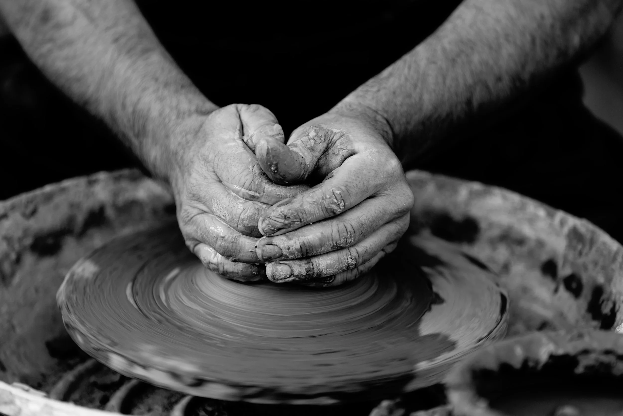
Ceramicist hand throwing clay at a potters wheel
Finally, the manufacturing process used for stoneware dinnerware of the 1960s and 70s played a role in its durability. Though artisan pieces were still primarily hand-thrown on a potter wheel, larger mass-manufactured pieces were made using slip casting. In this process, liquid clay was hand-poured into individual molds and allowed to be set for an extended period of time. This process ensured that each piece was uniform in thickness and shape, making it less likely to break or chip. Compared to today's speedy machine mass manufacturing, 60s-era slip casting was seen as a very tedious and time-consuming process, but it was cutting-edge technology at the time.
Undoubtedly, stoneware dinnerware from the 1960s and 70s is durable. It was intended to be a long-lasting investment for everyday family use. Pieces were designed to keep up with several modern convenience factors that contributed to its longevity. Today, stoneware is manufactured for different modern conveniences, including low shipping weight and internet trend cycles, making it cheap to produce and quick to replace. Considering its origin and motivations, it's really no surprise that vintage stoneware dinnerware is still an excellent investment for any home all these decades later.

The Comeback of Yellow and Brown in Mid-Century Home Decor

A Look at the Popularity of Warm Tones in the Swinging Sixties
Uncovering the cultural and societal influences behind a popular color trend
Vintage home decor lovers know the power of color to define an era—and in the mid-century modern movement, warm tones like yellow and brown played a starring role. These hues aren’t just colors; they’re cultural snapshots, deeply rooted in the social and design landscape of the 1960s and 70s. Today, these warm tones are enjoying a major revival, making a bold statement in modern interiors that blend nostalgia with contemporary style.
The 1960s were a decade of upheaval and transformation—socially, politically, and culturally. Yellow and brown glassware and home accents were everywhere, echoing the optimism, earthiness, and experimental spirit of the time. Yellow evoked sunshine, hope, and the carefree vibes of the Summer of Love and counterculture movements. It was a bright, cheerful symbol of peace, freedom, and possibility amid a world in flux. Brown rooted mid-century modern design in nature and simplicity. It reflected the growing appreciation for natural materials and warm, organic textures as a response to the machine age’s sterility. Together, these hues captured a perfect balance of youthful optimism and grounded practicality.
The popularity of yellow and brown in mid-century decor was about more than just aesthetics—it was a reflection of shifting values. The counterculture embraced bright, optimistic colors as a break from the gray uniformity of post-war life, while environmental awareness was rising and earthy browns connected interiors to the natural world. At the same time, innovations in glassmaking techniques and colorants made producing vibrant yellows and warm browns easier and more affordable, spreading these colors into countless households.
Fast-forward to the 2020s, and we’re seeing a fresh wave of interest in these warm vintage hues, especially a popular muted shade known as butter yellow. This softer yellow ties into today’s broader focus on sustainability, mindfulness, and cozy, lived-in spaces. Designers and collectors alike are drawn to yellow and brown for their ability to add warmth and personality without overwhelming a space, complement natural materials like wood, leather, and stone, and evoke a sense of timelessness and connection to the past—perfect for layering vintage with modern.
At CLAY+CODA, we celebrate how these colors allow vintage pieces to feel fresh again. Whether it’s a honey-hued glass vase or a walnut sideboard, these warm tones make every space a curated reflection of history and style. Styling these hues today means pairing butter yellow glassware or ceramics with neutral linens and greenery for balance, mixing deep brown wood furniture with lighter upholstery or metal accents to create dynamic contrast, and layering in textured fabrics like boucle or leather to enhance warmth and tactile richness. Using yellow as an accent through lighting, cushions, or decorative objects can inject energy into neutral rooms without overpowering them.
Choosing vintage yellow and brown decor isn’t just a design choice—it’s a sustainable one. Pieces from the 1960s and 70s were crafted with quality and longevity in mind, built to stand up to use and wear better than many contemporary mass-produced alternatives. By incorporating authentic vintage yellow and brown items into your home, you reduce demand for fast furniture and decor, embrace timeless design that ages gracefully, and connect your living space to the stories and craftsmanship of the past.
Yellow and brown aren’t just colors; they’re a warm, historic embrace that’s back with purpose. Whether you’re curating a full mid-century modern aesthetic or simply adding a few vintage accents, these hues bring depth, personality, and sustainable style to any home.
Discover a curated collection of vintage yellow and brown pieces at CLAY+CODA and elevate your space with authentic design that lasts.