

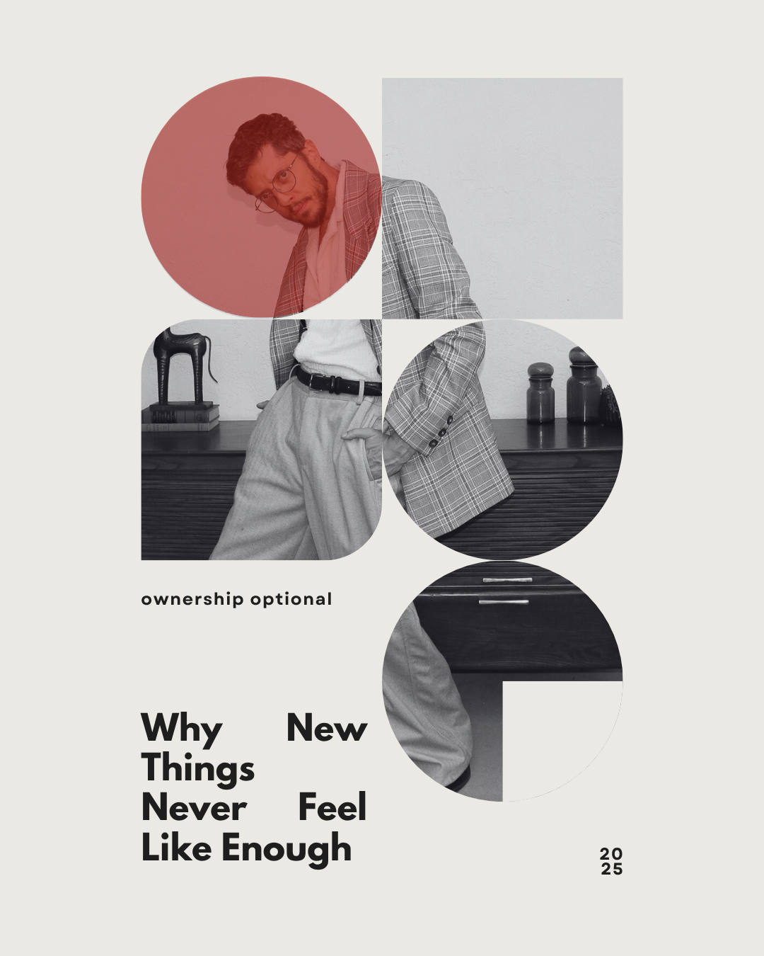
Ownership Optional: Why New Things Never Feel Like Enough
We are no longer buying for ownership. We are buying for the experience. Yet the only objects that truly stay with us are the ones that have already lived. Vintage is not nostalgia. It is an antidote.
Modern consumer culture is built on the promise that newness will complete us. A new dress, a new sofa, a new phone. The next upgrade will finally be the one that quiets the noise. Yet the opposite keeps happening. We buy more than ever and feel less satisfied than ever. Every purchase delivers a shorter thrill, a faster crash, and a longer list of returns. We are not living in a golden age of design or craftsmanship. We are living in an age of planned obsolescence and emotional depletion.
This is not an accident. It is an engineered cycle. Entire industries rely on the idea that we will never feel done. Newness is now a performance, not an experience. It is the creation of desire instead of the fulfillment of it. And in that cycle, new things will never be enough because they are not designed to be.
The History We Hold
Vintage interrupts this cycle not because it is quaint or charming, but because it carries something new items cannot replicate. Memory. Weight. Provenance. There is a difference between something that exists to be owned and something that existed long before you arrived. A vintage coat passed between five women over five decades holds a kind of narrative that fast fashion will never possess. It is an object shaped by lives, not just seasons.

Behavioral economists have long noted that humans attach more value to items with history. The “endowment effect” grows stronger when an object feels storied or lived in. We are meaning-making creatures. A new object has no meaning until we impose one onto it. A vintage object already holds meaning that we inherit. In that way, ownership becomes a collaboration between you and everyone who touched the object before you.
Newness is empty. Vintage is layered.
Why New Disappoints Us
We already have the data. Reports from the Business of Fashion, ThredUp, and global consumer studies all echo the same trend. People regret new purchases faster than they used to. Fast furniture ends up in landfills within three to five years. Clothing quality has declined as production has scaled. The resale industry is forecast to exceed a trillion dollars within the next decade, largely because consumers are exhausted by the buy-replace-repeat cycle that the modern market demands.
There is also the biology. Neuroscience shows the dopamine spike from buying new fades almost instantly. It is not satisfaction. It is stimulation. Stimulation does not sustain us. Vintage, by contrast, tends to create long-term attachment because it engages emotion. People treasure what feels rare, what feels found, and what feels like it belongs to a longer arc of human experience.
In short, new things are engineered for desire, not longevity. We are buying a feeling, not a future.
The Rise of Experience Over Ownership
Yet the cultural shift is not just toward vintage. It is also toward experience. Companies like Rent the Runway, Nuuly, FashionPass, and Switch have built empires on the idea that ownership is optional. You do not need to buy a three thousand dollar handbag. You only need to hold it for the week you want to feel like the woman who carries it. Luxury is no longer a financial commitment. It is a subscription.
Furniture rental. Art leasing. Closet memberships. People are choosing access instead of acquisition. The growth numbers prove it. Rental fashion grew by double digits through the last decade. High-end handbag memberships continue to soar, especially among young professionals who want the experience of the object without the responsibility of owning it.
Which leads to the real question. Do we want things at all? Or do we want the experience of them? Is the object itself important, or is it the feeling it gives us?
When Ownership Still Matters
Not everything should be rented. Not everything is meant to be temporary. There is a difference between trying on identity and building one. Vintage sits at that crossroads. A rental handbag is a mood. A vintage handbag is a relationship. A rental dress is a weekend. A vintage dress is a lifetime of stories.
Vintage invites us to choose what deserves to stay. It asks us to evaluate our values rather than our impulses. It rejects disposability. It honors craftsmanship. It offers a kind of grounding that the rental economy cannot provide because rental services prioritize circulation. Vintage prioritizes preservation.
In a world where so much is temporary, vintage allows ownership to regain meaning.

We Are Living Through an Experiential Shift
Sociologists have been documenting a larger cultural movement. People are no longer accumulating objects for status in the traditional sense. They are collecting experiences, aesthetics, and emotional identities. Identity is something people now build, not something they inherit. Minimalism rose, then fell, giving way to something more personal and narrative-driven. Material culture scholars point to a rise in “small but meaningful collections.” Objects that represent something. Objects chosen with intention. Objects that act like anchors.
This explains why vintage resonates. It offers a story already in motion. It offers a sense of place in a culture increasingly defined by disorientation. New things shout for attention. Vintage things feel like an answer.
Why New Will Never Feel Like Enough
Newness is thrilling only because it is unfamiliar. The thrill fades the moment familiarity sets in. That is why new things cannot hold us. They can only entertain us. Vintage is different. It holds depth. It holds memory. It holds the quiet assurance of something made to last and something that has already lasted.
We do not want more new things. We want meaning. We want stories. We want objects that remind us who we are and what we care about. We want to feel connected to something larger than the seasonal drop.
Newness can excite you for a moment.
Vintage can stay with you for a lifetime.
Ownership is optional, but meaning is not.

The Bar Cart Revival
Vintage Barware and the Return of Thoughtful Hosting
The return of the home bar didn’t arrive loudly. It came back the way meaningful things usually do: quietly, from living rooms and kitchens, in the soft glow of a lamp, in the small ceremony of inviting someone to stay awhile. After several years of fractured routines and public spaces that felt either overstimulating or impersonal, many of us began turning inward again. We are hosting at home — not to impress, but to connect. Recent consumer research reflects this shift: over 40% of U.S. adults say they host at home more often than they did before 2020, choosing intimacy and atmosphere over going out.
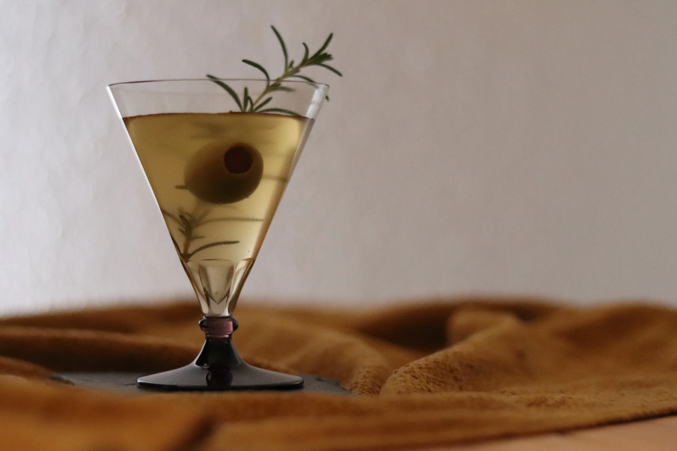
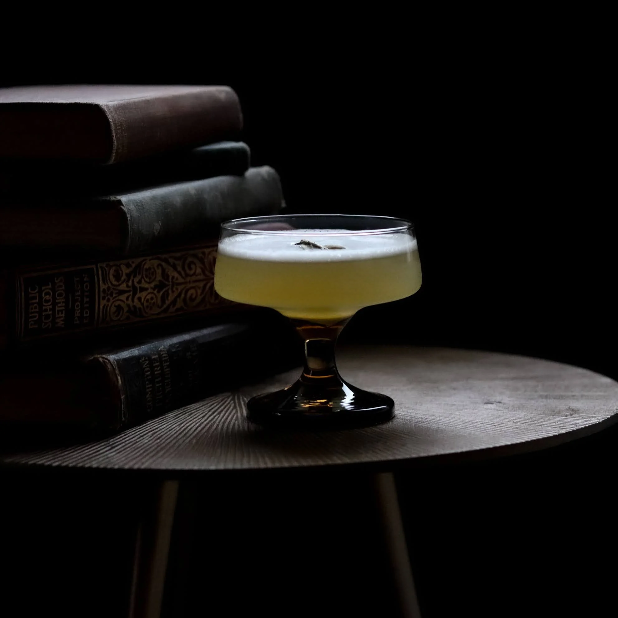
With this return to hosting, something else has resurfaced — the bar cart. But not the sleek mirrored one stocked with novelty glassware. What’s returning is the heritage cart: heavy-bottomed rocks glasses, smoked crystal coupes, etched decanters, and warm amber glass that once lived quietly inside a grandmother’s cabinet. These pieces have weight. They have presence. They make a drink feel like a moment.
In hospitality, there is a renewed emphasis on glassware as part of the sensory experience — the feel of the rim, the balance in the hand, the sound it makes when set down. Drinkware is no longer just a container, but part of the atmosphere and emotional tone of gathering (Arc Cardinal, Top Drinkware Trends Shaping 2025). This shift is mirrored at home, where the object itself carries the meaning.
There are two currents driving this revival. First, a cultural leaning toward gentle abundance — the idea that richness comes from presence, not excess. When the economy feels uncertain, we don’t stop wanting beauty or joy; we simply relocate those desires into smaller, closer spaces. A $9 bottle of wine, poured thoughtfully into a glass that feels storied, becomes an event. A quiet evening becomes memorable.
The second current is the rise of non-alcohol and intentional drinking. Zero-proof spirits and mixers have been one of the fastest-growing beverage categories in the U.S. for the past two years, with many younger adults choosing ritual without intoxication. And 41% of Gen Z now reports drinking less or not at all, while still valuing ceremony and taste. In many smaller cities where non-A cuisine is not yet mainstream, this shift is happening inside the home long before it appears on bar menus. The glass becomes the ritual, regardless of what’s inside it.
Vintage barware works because it is not neutral. It carries memory. A coupe isn’t just a coupe — it is a reference to another era of slowness, conversation, and lingering. The weight of a rocks glass can anchor a moment. A decanter on a table suggests that time is meant to be enjoyed, not rushed through. The weight, texture, and color available in vintage varieties are not something being produced today, and even if they were, the sustainability wouldn't be there.
These are objects that create mood, not just utility.
They turn a drink into a gesture that says; I prepared this for you and I cared enough to make it meaningful.
The bar cart revival is not about display or trend. It is a return to intentional living. To the art of making the ordinary feel special To evenings that unfold instead of perform.
Come in.
Sit down.
Take your time.
The night doesn’t need to be loud to matter.
It just needs to be real.
The Curator’s Eye: Crafting Your Signature Vintage Interior
Vintage isn’t just a style—it’s a lived experience, a personal rebellion against disposable culture. At CLAY+CODA, we believe vintage interiors should tell your story through layers of meaning, imperfect beauty, and curated connection. It’s about honoring history while making spaces that feel alive, inviting, and unapologetically real.

The Curator’s Eye: Crafting Your Signature Vintage Interior
Vintage isn’t just a look. It’s a lived experience. A way of setting intentions for how you want to move through your home, how you want to feel, and how you want your story to unfold. For me, that means a kitchen built for efficiency — get in, do your thing, get out. A living room that’s a stage, open and inviting, where the real stars are our friends and their ever-changing fashion. Bedrooms that feel restorative, places you retreat to—not just crash in. Yours might be different, and that’s the point: vintage is deeply personal.
Choosing vintage is a quiet rebellion against the relentless churn of modern consumer culture. It’s a way to honor craftsmanship, stretch the value of a dollar, and nod to sustainability. It also bridges socio-economic divides. That worn heirloom passed through generations is no different in spirit from a piece carefully sourced from The Sagrada gallery. When we launched The Sagrada, our goal was to shape identity through collected stories, artifacts, art, and moments that matter.
Balancing respect for history with modern life is key. One of my favorite pieces in my own home is a vintage record console — a massive wood cabinet we found nonfunctional at an estate sale. My husband refurbishes vintage electronics, and this particular console proved to be a challenging project. He poured hours into restoring it. Today, it lives in our dining room, serving as a buffet, a daily landing strip, and the soundtrack of our home. You can hear its music in the living room; it’s the heartbeat of the house.
People often think vintage means being trapped in a specific era. While I lean heavily into the ’60s and ’70s, vintage is fluid. The ’90s and Y2K are now vintage, winning hearts with younger collectors. Clinging rigidly to one period limits you. I see many older collectors scoffing at things they feel may not be “correct,” but that comes from a place of stagnation. They already hit their peak, let them ride it out, but don’t let those attitudes affect you. Time moves, tastes evolve—and vintage should, too.
I encourage people to think for themselves. Appreciate pieces even if they’re “not your vibe.” I say it out loud all the time: “It’s not my vibe, but it’s a vibe.” Learn to recognize and appreciate good engineering, quality materials, and pieces that distinctly embody their era or place of origin. Mixing wood tones and eras creates richness, not chaos. The best vintage interiors feel collected, layered, intentionally imperfect.
Stories sometimes can outweigh condition. I’m a furniture restorer, so I know when condition counts — some pieces, like a dresser, benefit from care. But I’ve seen ragged 100-year-old Japanese denim that was breathtaking. One client begged me not to restore her teak dresser despite damage, saying, “It’s only original once.” That stuck with me.
Our families shape how we relate to vintage. A friend’s family treasures Belleek China because the matriarch adored it. Some people learn youg not to touch the silk scraves, dont play on the cedar chest. These lessons about care and reverence are passed down, influencing how we build collections and live with our objects as adults. I think that is something to lean into instead of shy away from and connects us to nostalia and our personal pasts.
Artisan-made pieces are the backbone of authentic vintage interiors. They carry care, intention, and human touch that mass production can’t replicate. CLAY+CODA’s projects—and my home—are filled with these objects because they root a space in truth and warmth.
If mixing eras or wood tones feels daunting, forget the rules. Pick a color palette you love and let the rest fall into place. The era isn’t the point — connection and feeling are.
I started collecting vintage when I was 11. Of course, I didn’t know then that this would be a lifelong journey—one of discovery, restoration, and storytelling. Here we are, though, and my advice is to toss the rules. Collect what feesl good. Let your space reflect you and your life. Dont waste the energy of the money building something that you have to force yourself into when the option to move freely and let layers evolve around you is an option.
When someone walks into a CLAY+CODA-curated space, I want them to feel curiosity. To want to explore every layer, every story, every object. This isn’t a museum — it’s a home. Real, lived-in, and alive. It’s ok to touch things.
I choose vintage every time, unless it’s clearly not an option. It’s a constant dance between honoring the past and embracing today. But vintage is always my first choice.
One of my favorite items in my collection is my current home, designed in 1969 by an architect school dropout named Ivor, a motorcycle-riding artist and rebel. In a quiet neighborhood built for families and golf dads, this home was built for a party. The front is unassuming and windowless which provides me the privacy I crave. Its design puts guests at the forefront of the house and tucks the family in the back rooms away from the chaos. Every major gathering space opens to lead you to the pool. This energy is obvious the moment you step inside. When I do decide to open the big double doors, you see palm trees and stacked living rooms and my bikini-clad friends jumping off the diving board. That spirit informs how I live and design.
Vintage interiors are more than just furniture and décor. They’re about stories, resilience, care, and identity. They invite us to slow down, appreciate craft, and live intentionally. At CLAY+CODA, we help you craft a vintage home that isn’t just styled but lived — full of personality, history, and unapologetic truth.

Architectural Nostalgia: What Your Clothes and Your Walls Are Trying to Tell You
Discover how vintage fashion and historic architecture serve as powerful storytellers, reflecting culture, memory, and enduring craftsmanship. This piece explores why we’re drawn to objects and spaces that carry emotional weight and resist fleeting trends.

Maybe a When we speak of vintage, we often mean the look — the lapels, the glassware, the perfect grain of a walnut chair. But what we’re really collecting is evidence. Marks of a life that mattered. Proof that craft and care were once the norm, not the luxury.

Style and space — fashion and architecture — are the twin vessels of memory. Both are physical forms that carry the weight of lived experience. They are the skins and skeletons of culture.
In the image above, the curves of Pueblo Revival plaster hold the same quiet authority as the cut of a velvet jacket or the gleam of a vintage shell necklace. These things were made to last, not just structurally, but emotionally. They resist erasure. They resist trend. They ask you to notice them.
“Vintage is not about looking back — it’s about carrying forward what was never meant to be lost.”
We live in an era of impermanence — disposable buildings, fast fashion, algorithmic everything. But there is a growing hunger for material truth. People want to wear their values. They want to live in rooms that speak. And they are turning to the past, not out of nostalgia, but out of necessity.

A well-cut 1970s skirt suit does not just flatter. It tells you something about the ambition of the woman who first wore it. Just like a hand-troweled adobe wall speaks to the land it rose from. These things are not merely old. They are specific. They are storied.
“To live vintage is to treat your surroundings as a story — and yourself as its author.”
This is the philosophy behind everything we do at CLAY+CODA. We aren’t curating a look. We’re preserving memory. We’re making it possible for someone in 2025 to walk into a room and feel something built in 1965. For someone to wear a blouse and feel the echo of a life once lived — stylishly, powerfully, purposefully.

So whether you’re dressing for the day or decorating your home, ask yourself:
What am I remembering? What am I refusing to forget?

Eco-Friendly Dining: The Benefits of Cloth Napkins and Vintage Napkin Rings

Say goodbye to disposable paper napkins and hello to sustainable style with vintage napkin rings
Disposable paper napkins might seem like a small detail at mealtime, but their environmental footprint is far from insignificant. According to the Natural Resources Defense Council, paper napkins and towels account for over 4% of landfill waste and play a substantial role in deforestation. For those committed to reducing waste and embracing sustainable living, swapping paper for cloth napkins is a simple yet impactful change.
Cloth napkins offer durability and long-term cost savings, but they also elevate any table setting with a level of sophistication that disposable options can’t match. The tactile quality of fabric and the opportunity to choose from a range of textures, colors, and patterns add depth and intention to dining experiences—whether everyday meals or special occasions.
Go even farther with your sustainable dining setup by incorporating some vintage napkin rings. Those thoughtful touches are what gives your dining event some personality. These pieces are not just decorative—they’re a conscious choice to reuse and repurpose craftsmanship from past eras, reducing demand for newly produced goods. From brass and wood to ceramic and glass, vintage napkin rings come in a variety of styles that can complement any aesthetic. Truly, the possibilities are endless. Modern designs rarely capture the same heights of vibe.
Switching to cloth napkins paired with vintage napkin rings is more than just an eco-conscious decision—it’s a design statement. It signals a commitment to thoughtful living and invites guests to slow down and appreciate the details. Sustainable dining becomes a ritual of care and connection, where every element has depth.
Next time you set your table, consider ditching the disposable paper napkins and opting for cloth instead. The result is a dining experience that’s elegant, sustainable, and deeply personal—an investment in both style and the planet.

Escaping Beige: How Vintage Became the Go-To for Maximalists Seeking Bold Hues
A space filled with colorful vintage isn’t just visually striking; it’s deeply personal, layered with meaning, nostalgia, and a rejection of blandness. In an era obsessed with playing it safe, maximalists are proving that color is the ultimate rebellion.
In recent years, interior design circles have seen a noticeable shift: maximalists are increasingly turning to vintage pieces to infuse their spaces with vibrant colors and eclectic vibes. But what's driving this trend, and why is vintage the new darling of the "more is more" crowd?
Another year of beige was not something that everyone was excited about. The ultra-minimal vanilla cream that has become synonymous with modern luxury is becoming lifeless and dull. Pantone claiming Mocha Mousse as the year's color for 2025 was the nail in the coffin for many who are still scratching their heads, wondering how we got here.

Why has color disappeared from our daily environments?
For centuries, color has been a marker of self-expression, status, and cultural identity. Yet, in recent decades, it has been systematically stripped from our environments. Minimalism promoted a muted aesthetic, and mass production prioritized neutrals for cost efficiency. Corporate spaces embraced desaturated palettes under the guise of professionalism. Real estate markets push beige and gray as universally appealing, while fast fashion and disposable decor avoid bold hues to ensure mass marketability. The result? A world increasingly drained of vibrancy, where individuality is muted in favor of conformity.
“For centuries, color has been a marker of self-expression, status, and cultural identity.”


Advertisements for Franciscan dinnerware circa 1954
But this isn’t just a design preference—it’s a cultural shift with deep-rooted biases. Scottish writer and artist David Batchelor coined the term chromophobia to describe Western society’s aversion to color, where bold hues are often dismissed as garish and unsophisticated. In many ways, the erasure of color is a subconscious erasure of cultural richness, replacing centuries of artistic and personal expression with a sterilized monotony. Globally, color thrives on buildings and in ceremonial dress, art, and jewelry. Yet in the West, only neutralism is equated with luxury and longevity, despite the fact that throughout history, the rarest and most expensive dyes were the ultimate symbols of wealth and power. However, the tide is turning. Nostalgia-driven maximalism, a rejection of sterile aesthetics, and a growing appreciation for the boldness of the past are bringing color back. The resurgence of 70s and 80s design, vibrant branding, and Gen Z’s embrace of dopamine dressing all signal a cultural course correction. Color is more than just decoration—it’s identity, history, and emotion. And after decades of beige dominance, people are finally waking up to what they’ve been missing.

The Allure of Vintage Vibes
Vintage design didn’t shy away from color—it embraced it unapologetically. Unlike today’s mass-produced, neutral-heavy trends, past eras celebrated bold hues, rich patterns, and dynamic contrasts. From the vibrant jewel tones of Art Deco to the psychedelic swirls of the ‘70s, vintage pieces inject spaces with an energy and warmth that modern design often lacks. For maximalists, vintage is more than just a way to curate a unique space—it’s a way to reclaim color, layering eras, textures, and styles to create a home that feels alive. In a world of beige minimalism, embracing vintage is a statement: bold, expressive, and deeply personal.
Vintage pieces also offer something modern mass production simply can't—character. They aren’t just objects; they’re conversation starters, relics of artistry, and proof that great design stands the test of time. For maximalists, vintage is a goldmine. With sustainability on their side, they are able to curate the colorful spaces they crave, filled with depth, soul, and individuality. In a world increasingly dominated by the disposable and boring, vintage is the ultimate rebellion—bold, timeless, and utterly irreplaceable.

Colorful collection by @pueblomodern
Color Explosion
Forget about muted palettes; maximalists are drenching. Vintage maximalist decor is all about vibrant, daring colors, and that decor is getting an equally bold backdrop. There is a continuing rise of interior design projects that involve floor-to-ceiling color by way of paint and pattern. Jewel tones, bold reds, and deep blues are commonly featured, creating a visual feast for the eyes in kitchens, bathrooms, and GRWM style diaries.
“Vintage pieces also offer something modern mass production simply can’t—character.”
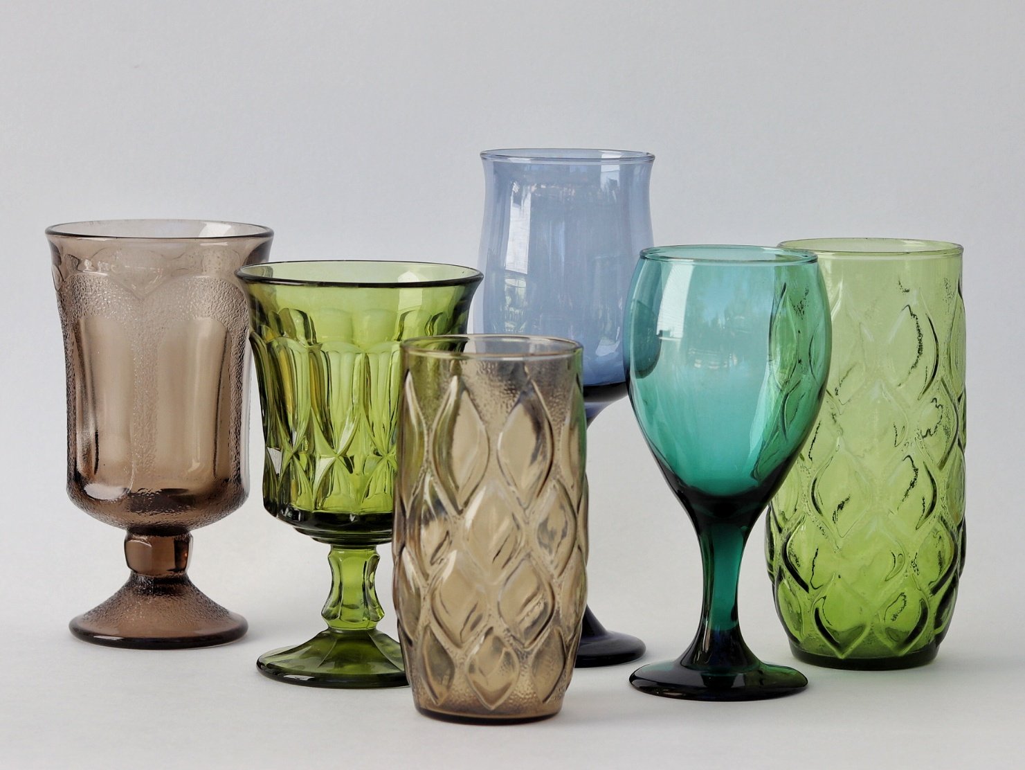
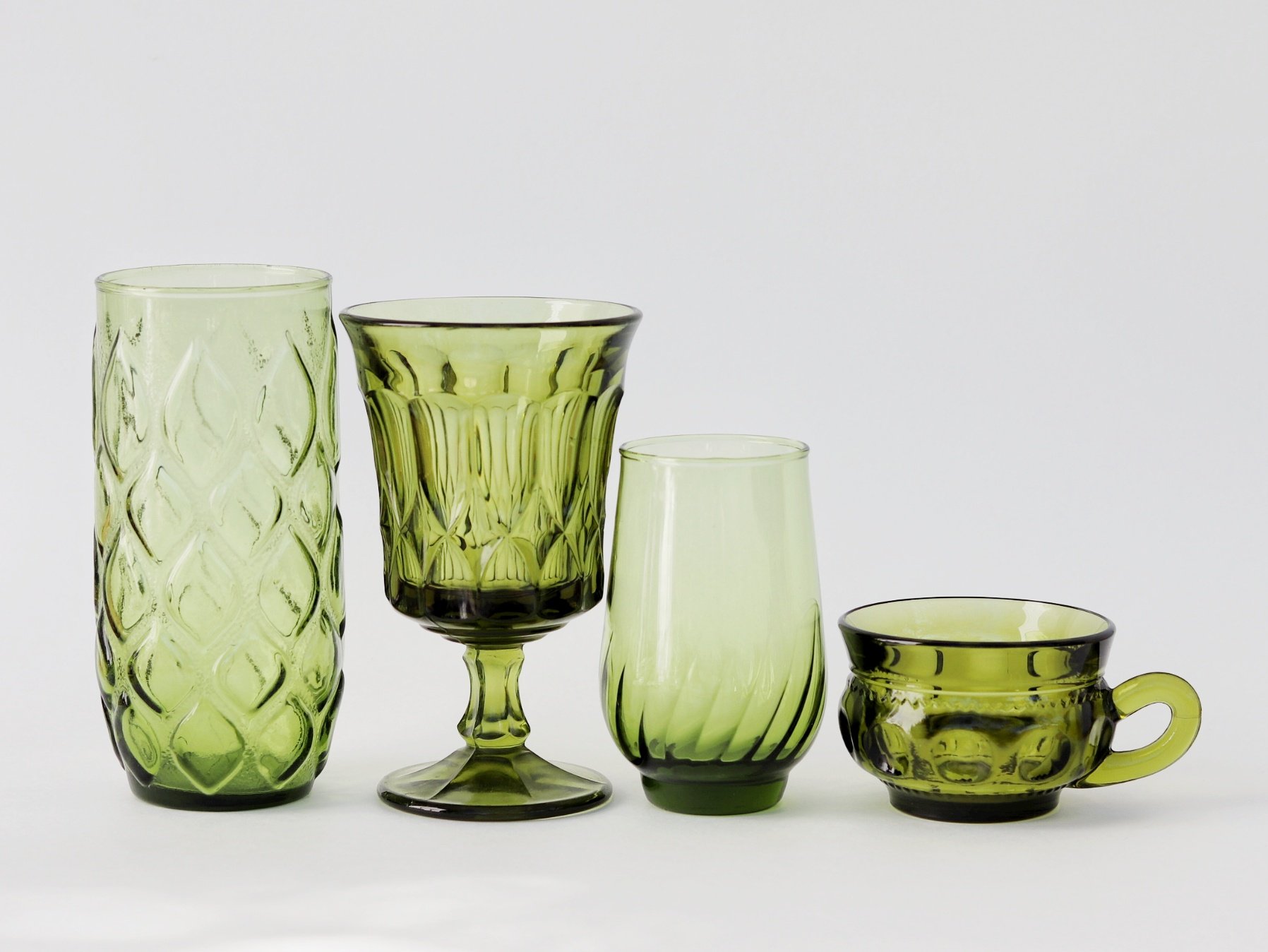
Vintage glass has become a must-have for maximalist collectors, offering a vibrancy and craftsmanship that modern glassware often lacks. Since most contemporary glassware is transparent, and anything with color is produced cheaply, the sturdiness, variety of shapes, and unusual colors speak the language of the modern maximalist. Certain colors and styles are especially coveted due to their rare materials—UV-reactive uranium glass glows green, cadmium-infused glass glows yellow, and selenium produces striking pink tones. Cobalt glass is another favorite that is seeing increased demand. For centuries, cobalt was mixed into molten glass to create deep, vivid blues, a tradition dating back to the 1700s. However, cobalt’s modern demand for use in solar panels, petroleum refining, and cellphone batteries has driven up costs, thus ending the affordability factor for glass artists everywhere.

Advertisement for Fostoria Jamestown Glassware circa 1962

Colorful vintage glassware from the CLAY+CODA studio collection
Maximalists are also turning to vintage textiles for their unparalleled depth and vibrancy. Unlike modern fabrics, which often rely on synthetic dyes that can appear flat or fade unpredictably, vintage fabrics—especially those produced before the 1960s—were dyed using natural pigments derived from minerals, plants, and insects. This resulted in richer, more complex hues that aged beautifully over time. Additionally, the environmental impact of modern dyeing processes has made mass-produced textiles less appealing, further fueling the demand for vintage materials that offer both aesthetic and sustainable advantages.

Colorful statement furniture is at the heart of maximalist design, where boldness and personality take center stage. Mid-century modern and Hollywood Regency pieces remain popular for their sculptural silhouettes. Meanwhile, Memphis-style and Postmodern designs bring an explosion of color and geometry, embracing asymmetry and unexpected forms that challenge traditional aesthetics. For those drawn to historical grandeur, Victorian and Art Deco furniture provide intricate carvings, high-lacquer finishes, and plush upholstery in rich jewel tones, adding layers of texture and opulence.
Whether sleek and futuristic or lavish and decorative, these vintage styles are the foundation for visually dynamic spaces that celebrate individuality and artistic expression and drama. These few examples hardly scratch the surface of what is available.

Curating a Personal Narrative
In a world where beige has been sold as the pinnacle of sophistication, maximalists are successfully pushing back and claiming their spaces in their own unique ways. The dominance of neutral briege and greige palettes has turned countless homes into lifeless, cookie-cutter backdrops, but maximalists know that a home isn’t meant to be a blank canvas—it’s meant to tell a story. And what better way to do that than with vintage? From the deep oranges and mustards of the '70s to the electric teals and magentas of the ‘80s, these pieces weren’t afraid to stand out, and neither are the people who collect them.
But beyond aesthetics, choosing colorful vintage is an act of defiance against the erasure of individuality we see happening in much of modern design. The modern market plays it safe—neutral colors sell, fast trends cycle in and out, and quality is often sacrificed for cost efficiency. Vintage offers an alternative: things that were made to last, with materials and techniques that embraced rich pigments and bold statements. By integrating these pieces, maximalists aren’t just decorating—they’re curating an identity. A space filled with colorful vintage isn’t just visually striking; it’s deeply personal, layered with meaning, nostalgia, and a rejection of blandness.
The Bottom Line
For today's maximalists, vintage pieces offer a treasure trove of possibilities. They provide vivid colors, intricate patterns, and unique stories that transform a space from ordinary to sensational. So, if you're looking to amp up the vibrancy of your life, diving into the world of vintage might just be the move.


Rediscovering the past and making it uniquely yours
A reintroduction to vintage as more than an aesthetic choice. An opinion piece by CLAY+CODA Creative Director Kimberli Roth

There is something understatedly intentional about styling one's life with vintage pieces. Because vintage finds are often one-of-one treasures, there is an inherent statement in choosing them. For many reasons which we will explore, vintage collections speak to richness in a way that a modern-day point-and-click drop-ship purchase never could. Though we live in a world overwhelmed by mass-market conglomerate-produced products, they still lack the nuance we crave. The anti-influencer is building momentum on Instagram and TikTok, big box stores are being canceled by younger generations of consumers. 2025 was marked the end of the trend era, and now many of us find ourselves searching for the missing elements we can't describe. It's under the fluorescent lights of some warehouse that we are faced with a truth that we always knew was there under the surface waiting for us to acknowledge: Individuality doesn't exist in the big box aisles. You can buy a dupe, but with that, you are admitting you've been duped.
And maybe trends really are dead. But where do we go now, without the tools to choose for ourselves?
I would like to reintroduce vintage as more than an aesthetic choice—I see vintage as an act of rebellion in a world of mass consumption. Buying vintage requires thought, choice, and discernment, traits that modern consumer culture actively discourages. We are trained to seek convenience, to be overwhelmed by options, and to buy impulsively. It sucks to wake up one day and realize that you have been made a victim by some faceless entity that is studying every move we make on our devices, listening to our conversations, waiting like a reptile in shallow water for us to inch toward satiating our thirst. We all must eventually drink something. When that time comes, the ads will follow, relentlessly, between moments that we are most vulnerable —seeking connection with our loved ones, seeking inspiration, certainty, and information. The ads will be there, knowing. It sounds farfetched, but we see it every day. This time, people are kind of over it.
“I see vintage as an act of rebellion in a world of mass consumption.”
The incoming sustainable era is a pendulum swinging. What we are seeing unfold before us is a natural response from consumers to a pressure thats become too much. Choosing vintage is an intentional pause, a refusal to be sold to, and an investment in objects that evoke joy, authenticity, and history. It is realignment with craftsmanship, story, and care. The missing element has been found, and although many of us still don't have the words to describe it, we understand it. We know we lost humanity for a second there. People crave to be surrounded by things that hold truth that we can bear. Objects that have not and cannot be exploited. A growing movement holds vintage pieces up to their phone cameras like ha! a purchase I chose for myself, and the origin is not horrific. It can be done.
Buying vintage is a rebellious act of the free-thinking consumer.
Why Choose Vintage?
Modern consumerism has become a cycle of disposability. Big-box stores push mass-produced goods that prioritize quantity over quality, designed to be replaced rather than cherished. This was not always the case. When I started CLAY+CODA, it was important for me to specialize in mid-century pieces from the 1960s and 70s because, in many ways, it was the last significant era of artisan craftsmanship. Soon after, we entered an explosion of neoliberal changes in the US: deregulation, privatization, and a new emphasis on building wealth through stock trades. These ideas and principals directly equated to lower-quality, mass-produced goods produced for global trade and a new measure of what a successful business should look like.
By the 1980s, businesses prioritized shipability over longevity, profit margins over materials, and planned obsolescence over lasting quality. The ethos shifted us away from designing items that endure. Businesses were no longer incentivized to produce things that last; they were incentivized to produce things that sell, sell often, and sell to an increasing number of people. More and more commonly, the returning customer is no longer looking for additional products because they were happy with their previous purchase; they are repurchasing the same item because their initial purchase was designed to be replaced. Designed obsolescence, made to break; today, that movement is everywhere, normalized and crushing the environment with its immense weight. The 1970s was the beginning of the end for the artisan, and so the CLAY+CODA collections stop at 1975—the end of the era when artistry still took precedence over profit.
The Art of Curating Vintage into Your Life
As society embarks en masse into this new sustainable era, we are paving the path as we walk it. Many of us are still not certain what is and what is not worth our time, our efforts, and most of all, our money. Like any art, it will refine naturally with practice, lessons learned, and some experimentation, but first we must learn how to find it.
After nearly 30 years of collecting, I am still learning new ways to source pieces I love. That said, 30 years is a long time to build up some pretty nuanced tastes. For most people and individuals who are newly embarking on their coexistence with vintage, there are some basic lessons I have learned about curating vintage into my life.

Kimberli Roth’s Dining Room Photographed by Adrift A Dream
The first is to understand when vintage is the better option and when it's not. Vintage pieces stand apart because they are made to last—made with materials and natural fibers that age gracefully. If graceful aging isn't the priority in any particular item, I skip it and get the new thing. You do not need a vintage everything to be a good person, and that's the nature of our lives today. Be skeptical of anyone who puts absolutes in place. When I am in need of something that inherently loses value with any kind of use, undergarments or a toothbrush, the vintage version is not the right option. If you are going for novelty, great, but in my opinion, it's not worth it otherwise. Vintage is the right answer for me when my cost per use outmonies the cost per use of the new version. This is employed with everything: clothing, furniture, decor, architecture, cars, electronics, and other machinery that can be repaired if they break.
For example, let's say I have two options: a new sweater and a vintage one. Both are cashmere. I will take into consideration the thickness, the origin, the travel from the manufacturer to me, the way the maker was treated, the cost, and then how many uses I will likely get out of that piece, the cost of any potential repairs. 100 wears for a $30 vintage sweater that will be worth $60 when I sell it back into the circular economy versus a $60 new sweater that I get 10 wears out of before the seam starts twisting and coming apart and is only worth $25 when I sell it someday (yes I know we don't all resell but never say never). 100% of the time the vintage option is the better option. This mental practice will start revealing some pretty wild insights into the true value of your purchases when you look into other categories of things as well; these considerations are not just for clothes.
The second major lesson in curation is learning to decipher an object from an objet d'arts. Something that is made to work versus something that is made to work beautifully. The difference between a piece that is functional versus a piece that is functional and has artistic value. Some pieces are richer in character, sparking conversation and admiration throughout time. There is something in us that can understand attention to detail in an object made by human hands; even decades later, we realize and respect when a person has taken the time and effort to hand-stitch a finish, employ thoughtful engineering, or add hidden design elements that were created for the user to experience a sense of discovery. These items are not simply to be taken at face value for their function; their form must also be considered. Art from artisans, craft from craftsmen, these are the things that were found commonly back then that we cannot get today without going directly to a modern artist. Your appreciation for certain works and your personal tastes can treasure seemingly mundane objects, and that is ok. Sometimes, we care very much about something, and we don't have to explain why. Art is like that. The important thing is that your appreciation for that object comes from within you and is not being told to you. Needing to own the 100-year-old hand-carved wood mirror with shell inlays is not the same as needing to own the viral Anthro mirror with the machine-stamped gold filigree. This is where items for surviving stop and items for living begin.
“Sometimes, we care very much about something, and we don’t have to explain why. ”
There is art to collecting vintage because there is art in it. We collect pieces that resonate with us, and those evolving curations are the amorphic gallery that represents our values, our habits, and our priorities.
A New Perspective on Shopping
Have you ever questioned why you buy what you do? Are you fully aware of who influences your purchasing decisions? If you’ve never physically interacted with a product but still feel compelled to own it, how did it get into your mind? Modern marketing is designed to create desire, but choosing vintage allows you to take back control. It challenges you to seek pieces that align with your values and aesthetics rather than simply reacting to ads. In a way, this style of shopping is opting out of the consumer cycle altogether and reclaiming your mind space. I personally love watching commercials as someone who is very firm in knowing that I’ll never buy what they are selling. When you shut off the valve to your impulses, marketing starts revealing itself in entertaining ways. It starts sounding stupid, desperate even, and you start seeing the irony of it all. Then, after a time, a new phase will emerge, and you begin to wonder, who falls for this? Who is watching this and thinking yes, that's good, I'll get that. When you start to see marketing messages and find them laughable, I think that is when you can confidently say that you have reached the free-thinking consumer stage.
Today, vintage isn’t just about nostalgia—it’s about freedom. Freedom from the endless churn of consumption, freedom to express yourself in a way that’s deeply personal, and freedom to coexist with objects that bring joy, meaning, and beauty into your life.
So, where do you begin? The journey to discovering your personal style always starts with exploration and learning to articulate what is important to you. Expose yourself to new things and allow yourself to fall into rabbit holes. Take some time to learn how things work and how things are made. Before you know it, you can appreciate when things work well and identify when things are made well. Take a moment to learn where different materials come from and why they are used. Flip through old media, obsolete media, magazines, and old movies. See ads drawn by humans. Learn about different movements and moments from history. Start influencing yourself. The more that you indulge in this practice and the more educated you become, the more you discover what truly speaks to you. Your true likes and dislikes will emerge, and your tastes and your personal nuance will refine. These are your choices, and there are no wrong ones. You will like what you like. You can care very much about one thing and very little about another. Those ebbs and flows, pushes and pulls are yours alone, and they cannot be replicated. Then, like magic, some of these one-of-one treasures will attract your one-of-one style. And maybe trends really are dead, but that wouldn't matter because you weren't dependent on them to define you.
Coexisting with vintage isn’t about recreating the past—it’s about rediscovering it and making it uniquely yours.


The Gazelle Doesn’t Flinch
Now Available online! Gazelle vase.

The Gazelle Doesn’t Flinch
Kimberli Roth with Royal Haeger, shot in New Mexico
Some pieces don’t ask for attention—they command it. The Royal Haeger Gazelle Vase is one of those pieces. Sculpted in the 1950s, it was never just decor. It was art pottery with backbone: a study in motion, muscle, and mid-century confidence. And now it’s part of the CLAY+CODA archive.
Shot barefoot in the backroads of New Mexico, Creative Director Kimberli Roth takes it out of the cabinet and into the wild. Holding it like a relic, not a prop. No tablescape. No manicured shelf. Just raw terrain, sharp lines, and a vase that still holds its own decades later.
Royal Haeger’s gazelle form was one of its boldest—angular, sculptural, unmistakably American. It was mass-produced, sure. But it wasn’t made to blend in. Neither is Kimberli. Styled in green mesh and brutalist pearls, she brings the gazelle back into motion.
This vase is already sold, but the energy sticks. At CLAY+CODA, we don’t just list artifacts. We show you how they move. How they live. How they can hold weight in a room without saying a word.

Trevor's Modern Life - soft opening
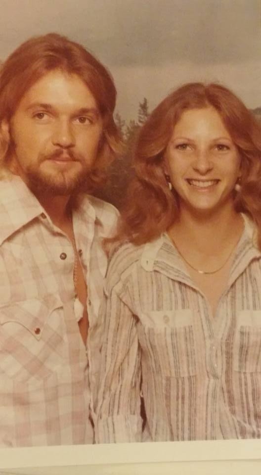
Trevors Modern Life, a new venture from CLAY+CODA, celebrated its soft opening at Antiques & Things on Route 66 in Albuquerque. Inspired by a 1970s photo of Trevor's parents.

Trevors Modern Life: Soft Opening of a Retro Wonderland
On a sunny weekday in July, a vibrant new venture, Trevors Modern Life, celebrated its soft opening at Antiques & Things on historic Route 66 in Albuquerque. This unique store is the latest project from CLAY+CODA, and it promises to transport visitors back to the groovy vibes of the 1960s and 70s.
A Retro Inspiration
Trevor's Modern Life is more than just an antique booth; it's a nostalgic trip inspired by a cherished photograph of Trevor's parents from the 1970s when they lived in Amarillo, TX. Trevor's dad is wearing a pearl-snap western shirt with several buttons undone and a shaggy wolf cut. His mom’s face is lit with a genuine smile and feathered shoulder-length hair. The image is perfectly sepia tones and shows the joy of life and love in a small town in the 1970s. “We never lived it, but we wish we did,” says Kimberli, CLAY+CODA founder and creative director. This image encapsulates the essence of a bygone era filled with warmth, color, and a sense of laid-back living. The store’s aesthetic and offerings reflect this inspiration, creating a space that feels both familiar and fresh.
Curated Vintage Selection
In a cozy 180-square-foot retail space, Trevors Modern Life offers an eclectic mix of vintage pieces. From furniture and lighting to coffee table books and unique decor items, every piece is carefully selected to bring a touch of retro charm into modern homes. Unlike CLAY+CODA's core offerings of classic high-end vintage design, Trevors Modern Life focuses on more accessible pieces and bohemian price points.
"We want to host pieces that you don't have to stress about ruining," Trevor explains. "It's hard for me to live hard and sink into a chair I know is worth $5,000. Some people can do it comfortably, but I'm a regular guy who's afraid to spill sh*t on the sofa."
The store carries vintage glass, brass, and wood pieces, with a particular emphasis on handmade items. The vibe is a little 70s funk meets boho, rooted in the Southwest with a cosmopolitan edge. Trevors Modern Life loves the mix of furniture and small items, creating an environment where it feels like you're walking into a completely new space. It feels analog, as if time slows down when you step inside, encouraging you to browse and discover the one-of-a-kind pieces that find their way onto the shelves.
The Perfect Home: Antiques & Things
Trevors Modern Life has found its perfect home within Antiques & Things, a renowned destination for antique lovers in Albuquerque. Situated against the back wall, Trevors Modern Life is easy to spot, thanks to its floor-to-ceiling windows that flood the space with natural light, creating an airy ambiance year-round. "I spent a lot of time scouting for a location, and I knew this was it when I saw the natural light," Trevor says. "I plan on recording YouTube videos here, so good lighting was essential. Plus, being next to the loading door makes moving bigger furniture pieces in and out easy."
Trevor adds, "This is an amazing place for someone just getting started, and I am very grateful to be alongside so many other great vendors and so much variety." With over 15,000 square feet of space and 75 of the city's finest vendors, Antiques & Things offers a diverse selection of merchandise. Once a Five & Dime store, the historic venue retains its original hardwood oak floors and old cases, adding to its charm. "This mall is a staple, and even though we are taking a different approach than your typical antique booth, they have really opened their arms to us, support our kookiness, and give us the freedom to do things our way, which is hard to come by."
Located on the iconic Route 66, Trevors Modern Life fits seamlessly into the historic and culturally rich environment of Antiques & Things, offering a unique blend of retro charm and modern convenience.
Looking Ahead
Trevors Modern Life is gearing up for its official ribbon-cutting event, which will be open to the public and will take place on September 14th from 4 to 5 p.m. This event marks the beginning of an exciting journey for the store.
Visitors to Trevor's Modern Life can expect a friendly and approachable atmosphere, where they can discover unique vintage treasures that evoke the spirit of the '60s and '70s. Whether you're a seasoned collector or someone looking to add a touch of retro flair to your home, Trevors Modern Life is a must-visit destination.
In addition to the store, Trevors Modern Life will launch a "Trevors Tell All" style YouTube series, hosted on the @claycoda channel. This series will offer an interesting look at what it takes to get a venture like this off the ground and running smoothly. "I want to help other people become vintage dealers; this is why we started," says Trevor. "I knew the shop and the YouTube series would be one package deal before I signed for the space."
Kimberli Roth adds, "We have been looking for an avenue to teach others where and how to start selling vintage, and it makes sense that we get our own hands dirty to show people what that looks like, starting from ground zero."
Stop by and enter a world where the past meets the present, and every item tells a story. Trevor's Modern Life is more than just a store; it's a celebration of an era and a lifestyle that continues to inspire and delight. Join us for the ribbon-cutting event and be part of this exciting new chapter, with many more exciting things to come and plenty of room for growth.


Moonstone by Anchor Hocking
Unique insights about a war-era glass production off the Anchor Hocking manufacturing lines when women were America’s primary workforce.

Anchor Hocking is one of America’s oldest glass producers, and we are delighted to receive an expansive set of mint-condition artifacts in our available collection. When discovering more about the history and creation of this set, we reached back decades farther into history than usual and found some surprises along the way.
Anchor Hocking, the glassware manufacturer we know today, has a long history. It first came into existence in 1905 when Isaac J. Collins and six friends raised $8,000 to buy the Lancaster Carbon Company in Lancaster, Ohio.
We know that Anchor Hocking did not invent Hobnail glass. We have found that the hobnail style of glass manufacture was originally produced and popularized in the Victorian Era (the Downton Abbey 1830s to about 1900). Most agree that it was developed by an artist at Hobbs Brockunier and Co. in West Virginia in 1886 by first pressing glass into a mold with hobnails all over it and then hand-blowing and shaping the piece. This early form of hobnail glassware was known as Dew Drop Glass. Sometimes the tops of the "dew drops" were made opalescent by reheating the surface of heat-sensitive glass near the furnace, aka "glory hole." It was commonly made into pitchers with matching drinking glasses for elegant ladies' luncheons and picnics.
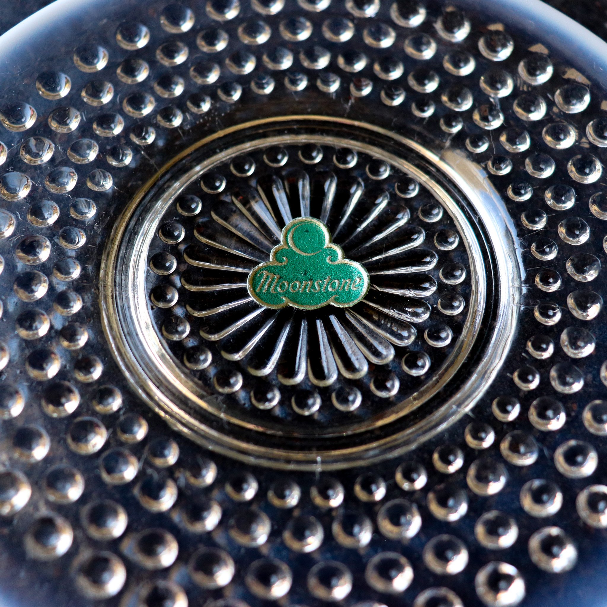
Anchor Hocking moonstone original sticker circa 1942-1946
Nearly 100 years later, during the great depression, Hocking set out to democratize the dew drop glass style and introduce hobnail to Americans outside of high society. Bright colors like pink, clear with red trim, and some pieces in ruby were providing a sense of luxury and cheer in hard economic times. It was nearly 10 years after they began producing hobnail glass that they began manufacturing their own Moonstone opalescent hobnail glass. This decade was needed for Anchor Hocking to develop a way to mass manufacture that elusive opalescent tipped look. A triumph in American manufacturing, the first pieces of Moonstone arrived in 1942, just after we marked the end of the Depression and the beginning of WW2.
With the war on an upswing, a large majority of American men were drafted to serve, and the remaining workforce was primarily comprised of women. It is not a far stretch to imagine that the hands that worked the glass pressing machines would have been women, quite a different scenario to the pink pieces manufactured just a decade earlier. These pieces are from an era prior to the significant post-war economic and style shift.

Anchor Hocking ruffled edge Moonstone Bowl and Dinner Plate circa 1940s
The Moonstone pattern, made from hobnail molds, features primarily transparent glass bodies with white opalescent glass highlights on the tips of the hobs and edges of each piece, sometimes reflecting shades of blue or amethyst. It took many forms, from traditional dinnerware pieces like plates and cups to impressive serveware, accessories, and table decor. Several of these pearlescent pieces, especially the tableware, host hyperfeminine ruffled edges, making for a striking display when a place setting is stacked. As was popular in the era, several serving pieces were divided to carry several small treats, and it was common for use with sweet and savory offerings. Large punch bowls were made for social gatherings, and though it was a century after the first hobnails came to be, elegant ladies still used matching pitchers and drinking glasses for luncheons and picnics. This time, though, they were catching daylight on their tables in the twinking opalescent glow of Moonstone.
Hocking continued production through 1946. A short run, making these particular pieces rare and collectible.

Opalescent hue shows and glows with different angles and light.
Artist Highlight: Jim McBride
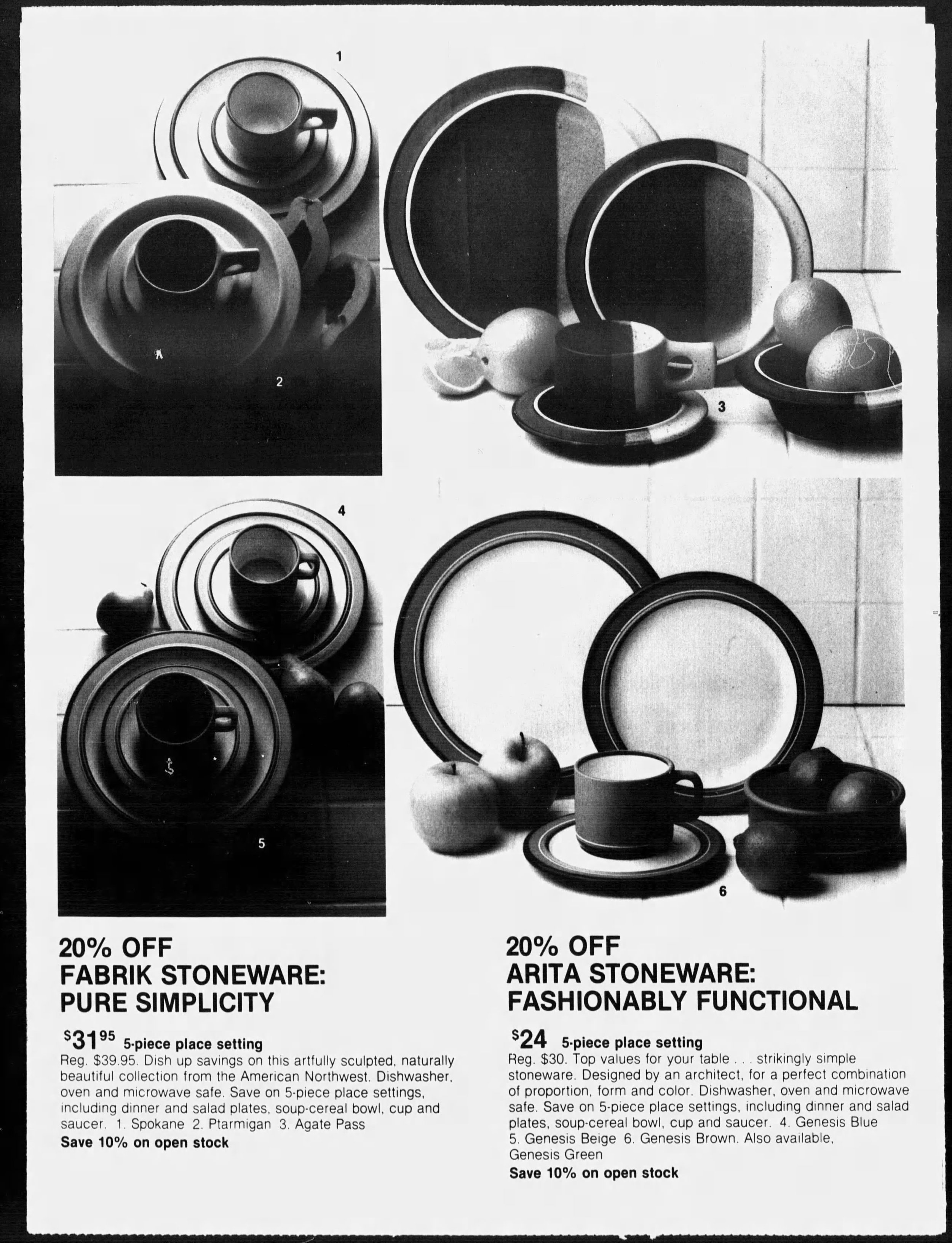
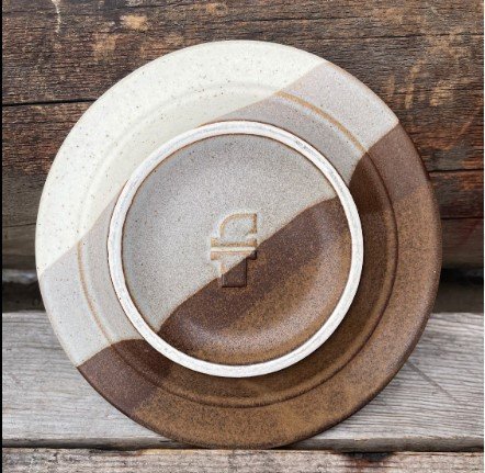
Learn about the timeless forms and impeccable hand-finished construction of 1970s Fabrik by Jim McBride designs, why they are synonymous with the Pacific Northwest, and why they continue to charm dinner guests across the country.

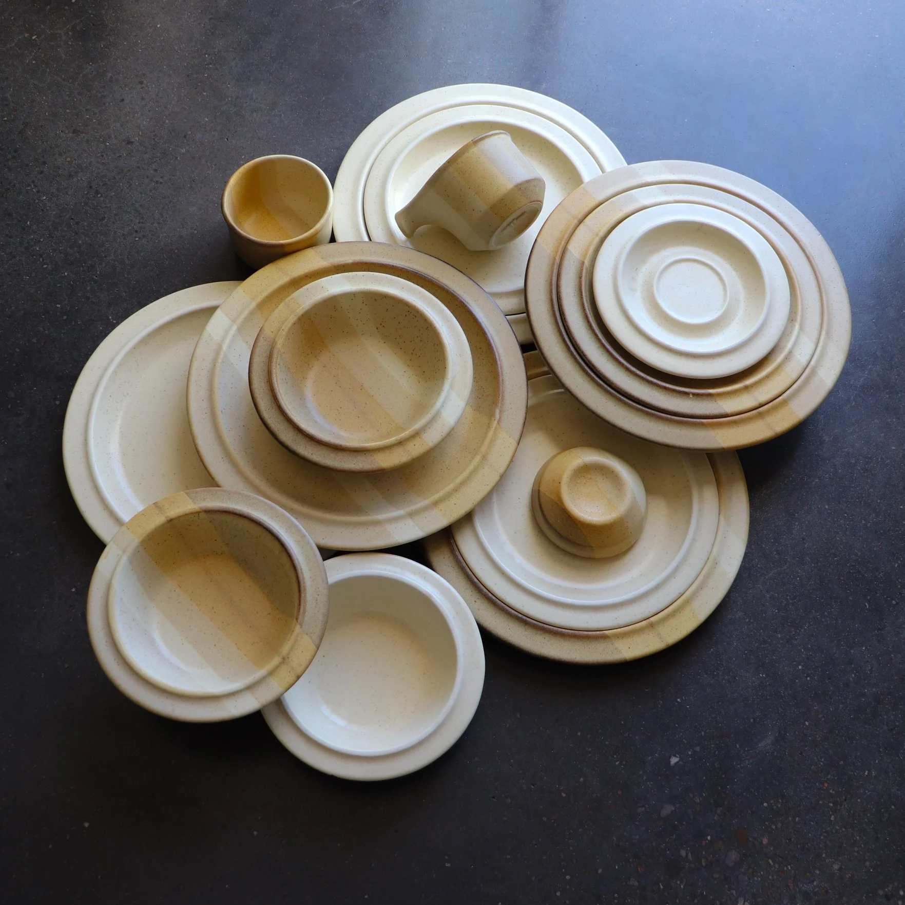
Salishan and Ptarmigan pattern dinnerware circa 1970s.
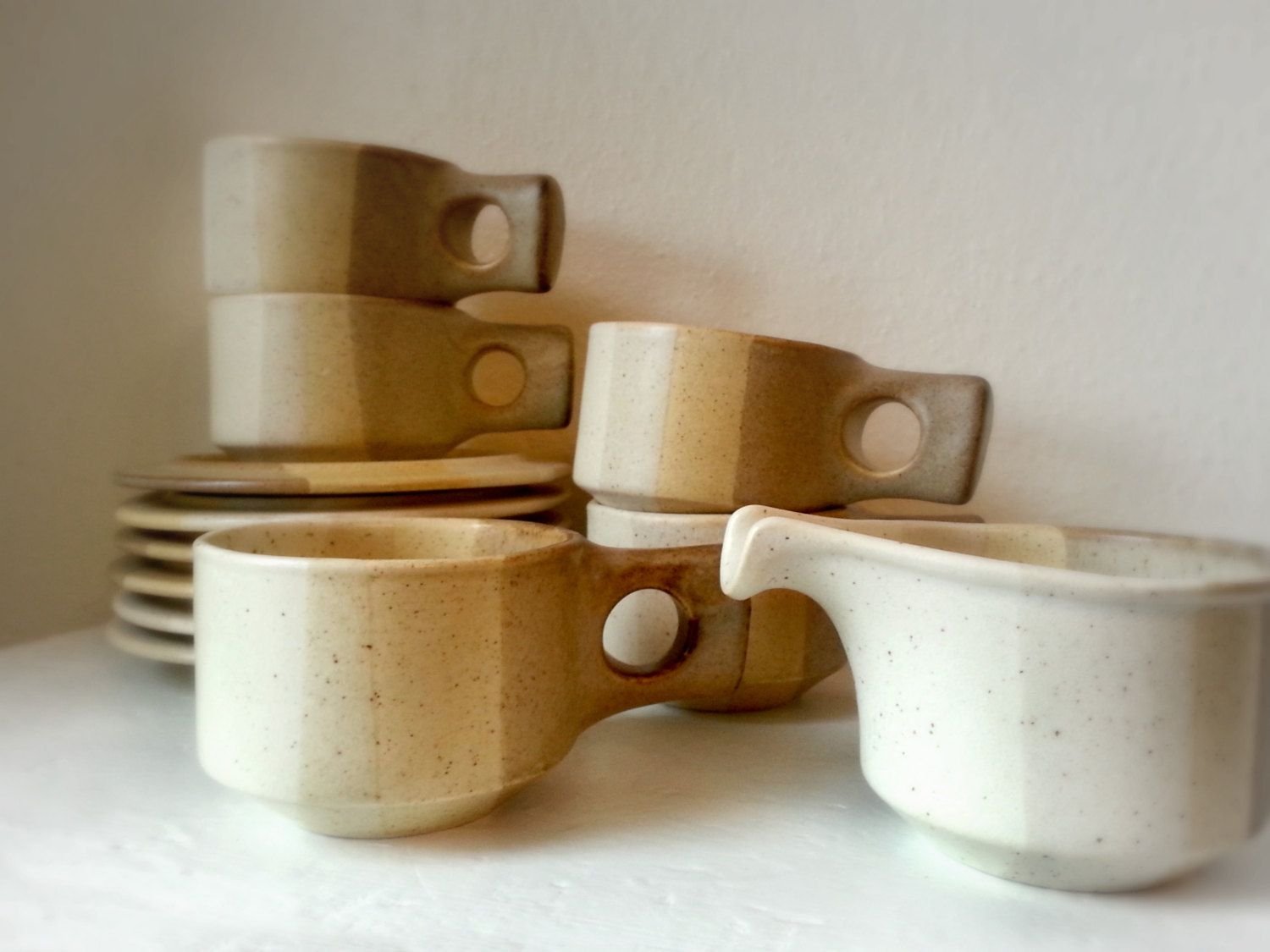
Salishan cups, saucers and creamer designed by Jim McBride for Fabrik.
While working as a pottery apprentice at Pottery Northwest, Jim McBride dreamed of opening his own factory. In the 1970s, he saved up enough money to purchase some secondhand mass-production equipment and opened his own doors under the name Fabrik at 701 6th Avenue, North Seattle, Washington.
Jim developed a distinctive dinnerware line, including plates, cups, and some serving pieces. The pieces are heavy, molded, and glazed with smooth matte finishes in simple overlap/interface patterns in varying combinations of earth tones. The hand-crafted work is known for its ram-pressed clay construction, outward slanted rims, and unusual handles. Plates stack into each other, creating a space-age flying saucer silhouette; salt and pepper sets are sculptural blocks with perfectly circular center-punched holes that pair nicely with the perfectly circular handles on the tea and coffee cups.
The artisan pieces are thick, substantial, and highly striking yet made to endure daily use and provide functionality to the modern home of the 1970s. Every piece was manufactured to be used in the oven, table, freezer, or microwave.
September 7th, 1980. Chicago Tribune.
To celebrate the home pride of the man and the company, all of the colorway names were regionally inspired.
Agate Pass; a high-current tidal strait in Puget Sound connecting Port Madison and mainland Kitsap County in Washington.
Verticle tri-color dipped design in deep brown, gray, and buff.
Salishan; a tribe indigenous to the PNW.
Vertical stripe in buff, cream, and beige.
Spokane; The name “Spokane” is often translated as “children of the sun,” most likely stemming from the name of a chief, Illim-Spokanee, first encountered by fur traders, whose name was translated as “Son of the Sun”. Spokane is now the name of a town 4 hours outside of Seattle.
Buff with brown fleck surface and brown banding.
Ptarmigan; A bird found in the Cascades from Wahstington’s Mt. Adams north to the U.S.-Canada border.
Plain body with brown flecks.
Foxfire; the phosphorescent light emitted by certain fungi on decaying timber.
Verticle stripe in grey, beige, and sandstone pink.
The company did manufacture custom work and some limited colorways, so some rare-to-find pieces are out there. Some known short-run colors of the original Agate pass vertical stripe designs are known to exist in raspberry and dusty pink, and in navy and cornflower blue. We also see a version of Ptarmigan in a brown body with speckles.
The unique style was met with great appreciation, and at its height, Fabrik could employ more than 15 artists to manufacture pieces for distribution nationwide. We know that there was a waterfront restaurant featuring Jim’s pottery near the factory and that The Bon’s in Southcenter’s china and gift department offered children’s own hands to be printed permanently on the stoneware to be hand finished and hand glazed for pick up as personal keepsakes in time for Fathers Day. Several shops provided Fabrik designs for wedding registries.

The raised “F” signature makers mark is found on the bottom of every Fabrik piece.
Fabrik logo on the underside of an Agate Pass pattern saucer.
Fabrik pieces appear in boutique catalogs and advertisements, which are heavily concentrated in the Pacific Northwest but also highlighted in a few key areas across the country. Regionally, they sold at The Country Corner in The Marketplace in Fairhaven Village. We also see Fabrik sold at all of The Bons locations. In Washington, we see Bon’s ads in Tacoma Mall, Bellingham, and Southcenter. Bon’s had locations throughout Montana, including cities like Missoula and Great Falls. Bon’s also listed Fabrik in Coos Bay, Oregon, and in Twin Falls and Boise, Idaho.
For cities outside of the PNW, we see several ads for Fabrik concentrated in the West but reaching key locations as far as the East Coast. In the West, we see listings at American Furniture and Jans Pan-tree in Albuquerque, New Mexico; La Boutique in Carlsbad, New Mexico; Tabletop in Tuscon, Arizona; and several Macy’s in Northern California. In middle America, we see listings for Yes, Virginia in Bismark, North Dakota; Marshall Fields in Chicago; Ben Simon’s in Omaha, Nebraska and Bin & Barrel, Corpus Christi, Texas. In the East, we see Elegant Accents in Tampa, Florida, and Scan Design at the Carriage Gate Center in Tallahassee, Florida. This is not a comprehensive list of locations where Fabrik was distributed but it gives collectors an idea of where to look to find more pieces by Jim McBride.

Concentration of known Fabrik ads published throughout history.

May 9th, 1975. The Bellingham Herald. Mary McBride makes an in store appearance.
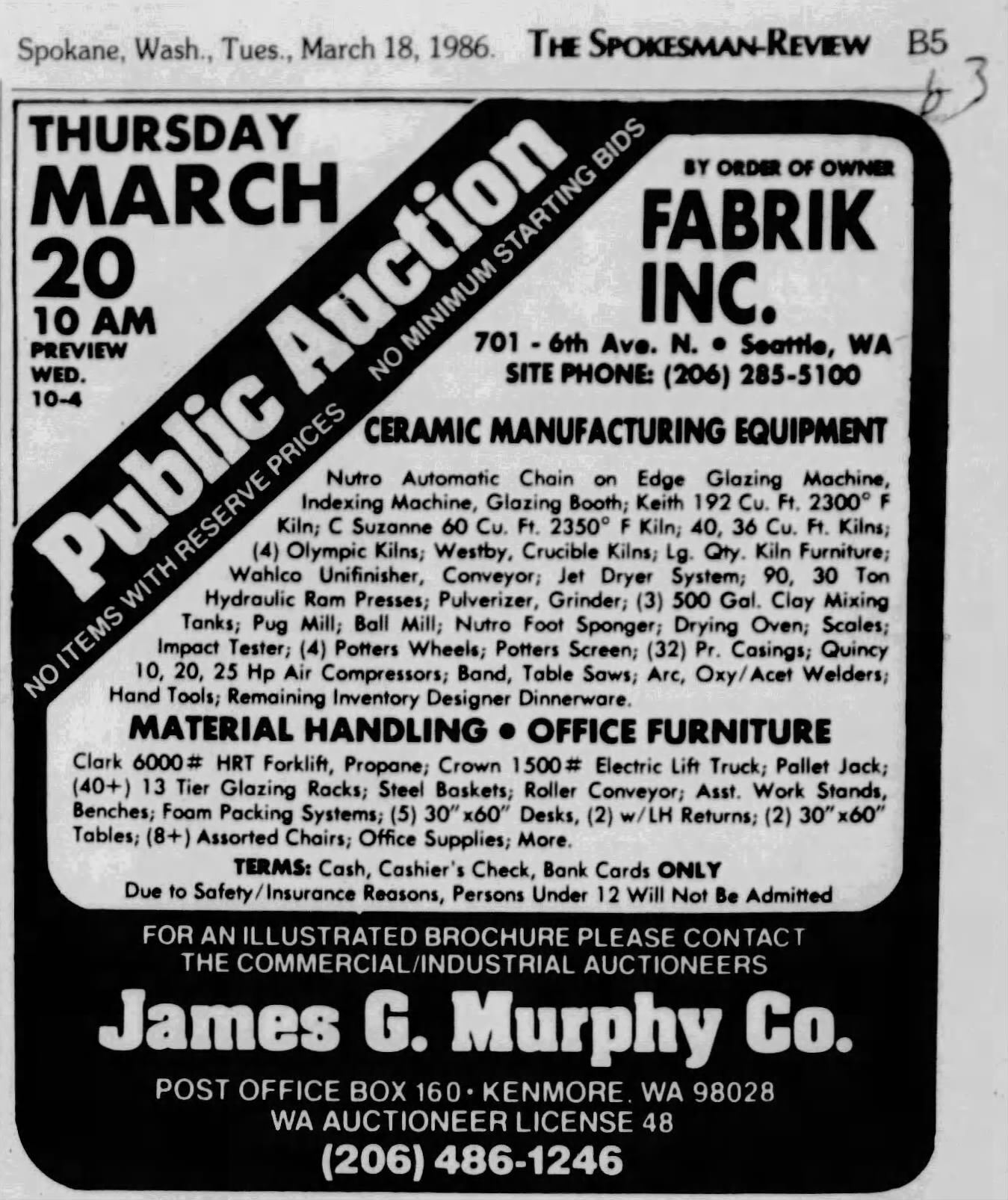
After flourishing for many years, the Fabrik factory lost its way in the early 80s when Jim and his wife Mary, who had been running the business together, filed for divorce. Jim started experimenting with a bold new direction which did not resonate with customers. During this time, Jim created the unappealing American Quilt Collection (1984), whose name refers to a vibrant patchwork of different cultural and ethnic pockets residing within a larger community. It was the only colorway name that was not explicitly representative of the PNW. The collection was buff white with center-stamped navy blue geometric motifs and thin blue banding. Some of the newly developed pieces were unimaginative and tastelessly ornamented with handpainted words. The business rapidly deteriorated to the point of bankruptcy and officially shut its doors in the mid-1980s.

September 12th, 1982. The Journal Times. Ad for American Quilt by Fabrik.
We found the public auction advertisement from James G. Murphy Co. listed in the Spokesman-Review (Spokane, Washington) on March 18th, 1986. The listing provided details on the auction's contents as Fabrik cleared its operation. The auction included ceramic manufacturing equipment, everything from glazing machines to industrial kilns, hydraulic ram presses, pottery wheels, pulverizers, table saws, and the remaining dinnerware inventory. There is a potential that the purchaser of the remaining inventory and original molds tried to continue the brand. In a 1990s message board, one woman mentioned that she discovered a Fabrik website not managed by McBride on a search engine. This, of course, has long disappeared, so clearly, they had no success in continuing the Fabrik legacy.

Example of American Quilt by Fabrik circa 1980s.
Today, the timeless forms and impeccable hand-finished construction of the original 1970s Fabrik by Jim McBride designs are a favorite in functional mid-century collectibles. They are synonymous with Pacific Northwest mid-century design and continue to charm dinner guests across the country.

Why Vintage Glassware is Bursting with Vibrant Colors
In the past, glassmakers utilized various techniques to infuse colors into their creations.

Have you ever wondered why vintage glassware is bursting with vibrant colors while modern-day glassware tends to be mostly clear? 🤔 Let's explore the fascinating reasons behind this shift.
In the past, glassmakers utilized various techniques to infuse colors into their creations. They incorporated vibrant pigments like manganese, cobalt, uranium, and even gold during the glassblowing process. These elements created stunning hues, ranging from rich blues and greens to radiant reds and yellows. Vintage glassware truly reflected the creativity and craftsmanship of the artisans behind them.
However, as time went on, the demand for clear glassware increased.
Clear glassware gained popularity due to its versatility. It allowed the colors of the fine wines to take center stage and became preferred for formal occasions and fine dining.

Technological advancements played the most significant role. Developing more transparent glass formulas and refining production techniques made it easier to mass-produce clear glassware. This resulted in cost-effective (cheap!) manufacturing processes and broader availability for consumers.

Still, the allure of mouth-blown vintage glassware remains unparalleled. Especially if you already know the color of your favorite chard pretty damn well. The vivid colors found in vintage pieces add a touch of nostalgia and personality to any table setting. They evoke a sense of history and are cherished as collectibles, reminding us of the unique craftsmanship and design aesthetics of bygone eras and artists.
Raise a toast to the colorful past and the clear future of glassware! 🥂✨

Ceramicist Rupert Deese
From B-17 mechanic to renowned ceramist: Rupert Deese's journey from military service to museum collections.

Rupert Deese and Madeira, one of his many collections for Franciscan.
Rupert Deese was born in Agana, Guam, where his father served as a Marine Corps officer. After graduation from high school in 1942, he enlisted in the Army Air Corps, serving stateside as a B-17 mechanic. Deese graduated with a Bachelor of Arts degree in 1950 from Pomona College. After graduation, he started working as a ceramist in Claremont, California.
In the mid-fifties, supported by a grant from local art patrons Robert and Catherine Garrison, Deese entered Claremont Graduate School, studying ceramics.
After receiving his Master of Fine Arts in ceramics in 1957, Deese continued making his own ceramics in his studio. However, like many artists, he found it necessary to supplement his income. After graduation, he began teaching ceramics at Mt. San Antonio College in Walnut, California, and remained on the faculty until 1971.
Deese's pottery gained national recognition in 1960 when his covered bean jar won the IBM sweepstakes prize at the prestigious 21st Ceramic National Exhibition at the Everson Museum in Syracuse, New York.
In 1964, Deese accepted a full-time position as a designer in the Franciscan Ceramics division of Interpace (International Pipe and Ceramics Corporation) in Los Angeles.
For the next twenty years until his retirement in 1984, Deese created shapes and patterns for Franciscan dinnerware, glassware, and flatware. In the evenings and on weekends, he continued to work on his own ceramics in his Padua Hills Claremont studio.
Deese created numerous custom pieces, including a United States Capitol Members' Dining Room planter. His work can be seen in several prestigious museum collections, including the LACMA in California and the Museum of Fine Arts in Boston.

Exploring the Durability of 1960s and 70s Stoneware Dinnerware
Discover why stoneware dinnerware from the 1960s and 70s is renowned for its durability and practicality.
Several patterns and shapes of 1960s and 1970s dinnerware
Stoneware dinnerware of the 1960s and 70s is well-known for its durability and longevity. This type of dinnerware is made from clay that has been fired at high temperatures, making it resistant to chips, cracks, and scratches. But what makes stoneware dinnerware from this era so durable compared to other types of dinnerware?
First, we must explore the unique cultural shifts happening around the dinner table at the time because, in many ways, this was the driving force behind many of the changes occurring in the market. By the 1960s and 70s, newer technologies like the microwave oven and the automatic dishwashing machine were commonplace. This encouraged dinnerware manufacturers to innovate as young households ditched mother and grandmother’s delicate porcelains with silver and gold embellishments that could not be microwaved. Another thing to consider is the number of women who had entered the workforce by this time. It was common for children old enough to spend a few after-school hours at home alone. People wanted their kitchens to revolve around ease with minimal clean-up, which introduced an era of extra durable oven-to-table-to-freezer pieces.
So, what technologies and changes were made to accommodate the modern family of the 1960s and 70s? Well, several.
One reason vintage stoneware is seemingly everlasting is the quality of the clay used. Stoneware clay is naturally more durable than other types of clay because it has a higher firing temperature, which makes it harder and less porous. The stoneware clay used in the 1960s and 70s was typically of a high quality compared to today’s. It was fired at high temperatures, which resulted in a stronger and more durable final product.

1970s Stoneware dinnerware designed by Jim McBride in Seattle for his company Fabrik
Another reason for the durability of stoneware dinnerware from this era is the glazes used. Glazes are applied to the surface of the stoneware to make it smooth and waterproof and to add color and design. The glazes used on stoneware dinnerware of the 1960s and 70s are high-quality, with a focus on withstanding both machine dishwashing and several blasts of 1970s-strength microwave radiation. This particular attention to glazes meant they were less likely to chip, crack, or craze. Crazing is a spiderlike cracking to glazing, which is not structural damage (makes it more susceptible) but can leave spaces for mold and harmful bacteria to fester. You see this a lot in pre-60s dinnerware.
Additionally, stoneware dinnerware from this era was often thicker and heavier than other types of dinnerware, which added to its durability. Though this was primarily an aesthetic choice of the era to emulate a back-to-nature rustic feel, the weight and thickness of the stoneware made it less likely to become damaged, even with daily use.
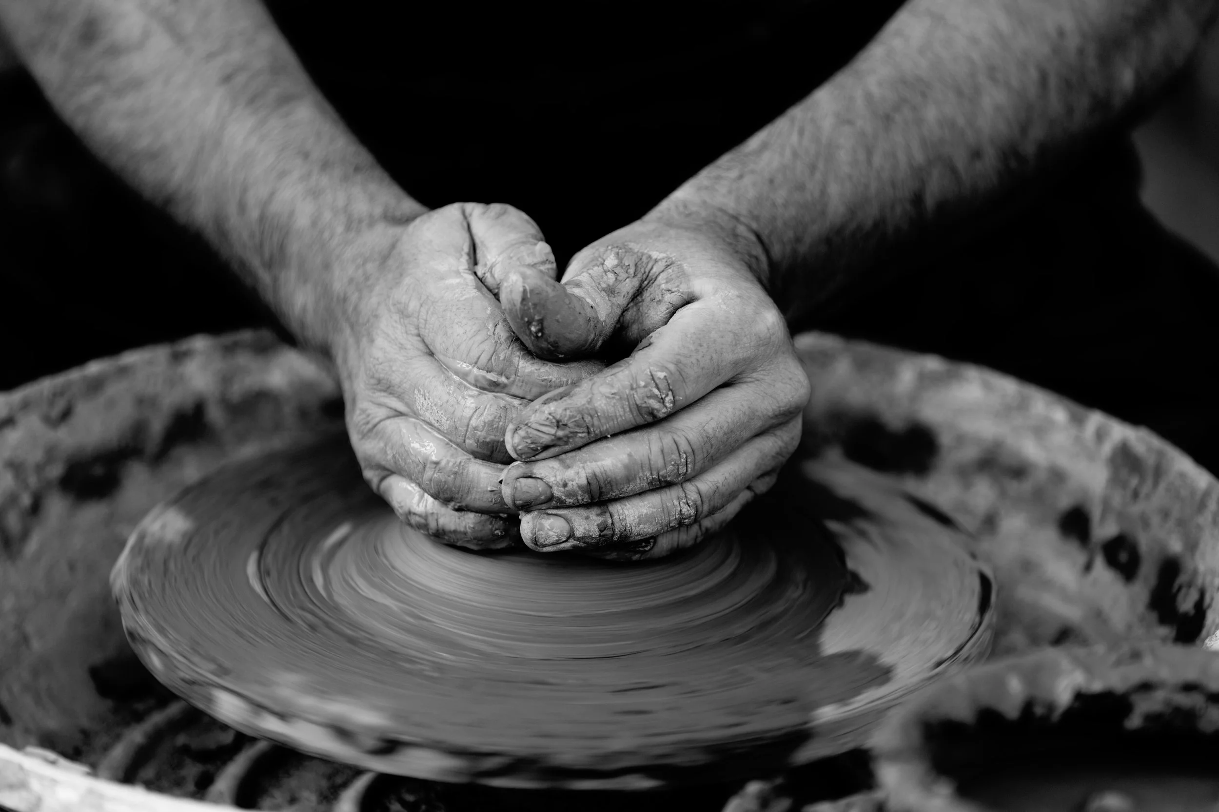
Ceramicist hand throwing clay at a potters wheel
Finally, the manufacturing process used for stoneware dinnerware of the 1960s and 70s played a role in its durability. Though artisan pieces were still primarily hand-thrown on a potter wheel, larger mass-manufactured pieces were made using slip casting. In this process, liquid clay was hand-poured into individual molds and allowed to be set for an extended period of time. This process ensured that each piece was uniform in thickness and shape, making it less likely to break or chip. Compared to today's speedy machine mass manufacturing, 60s-era slip casting was seen as a very tedious and time-consuming process, but it was cutting-edge technology at the time.
Undoubtedly, stoneware dinnerware from the 1960s and 70s is durable. It was intended to be a long-lasting investment for everyday family use. Pieces were designed to keep up with several modern convenience factors that contributed to its longevity. Today, stoneware is manufactured for different modern conveniences, including low shipping weight and internet trend cycles, making it cheap to produce and quick to replace. Considering its origin and motivations, it's really no surprise that vintage stoneware dinnerware is still an excellent investment for any home all these decades later.

Cottagecore, Gardencore and Vintage Aesthetic

Cottagecore, Gardencore, and the Vintage Aesthetic: Why This Nostalgic Style Still Captivates
In recent years, Cottagecore and Gardencore have blossomed into powerful aesthetic movements, capturing the imagination of people longing for a slower, more intentional way of living. Rooted in romanticized visions of rural life, these styles celebrate nature, simplicity, and handcrafted beauty—making them natural partners to vintage design and décor.
At their core, Cottagecore and Gardencore are about embracing the imperfect, the authentic, and the timeworn. They invite us to reconnect with traditions that feel lost in our fast-paced, mass-produced world. Whether it’s the warm glow of sun-dappled floral linens, the gentle rustle of a vintage wicker basket, or the subtle patina on a well-loved wooden chair, these details evoke a comforting sense of home and history.
Why Vintage Fits Seamlessly with These Movements
Vintage pieces are more than just decorative accents—they’re artifacts of craftsmanship, storytelling, and sustainable living. In the world of Cottagecore and Gardencore, vintage furniture, ceramics, and textiles ground the aesthetic in authenticity. Each item carries a legacy, inviting you to participate in its ongoing story.
These vintage elements also provide essential texture and depth, balancing the softness of natural fibers and floral patterns with materials like worn leather, weathered wood, and hand-thrown pottery. This layering creates spaces that feel lived-in and lovingly curated rather than staged.
The Cultural Appeal: Escaping the Modern Overwhelm
The surge of Cottagecore and Gardencore can be seen as a cultural response to digital overload and environmental anxiety. These aesthetics offer an antidote to the constant barrage of online trends and mass-market consumerism by prioritizing connection—to nature, to slower rhythms, and to heirloom quality.
For many, adopting these styles is less about strict rules and more about mindset: a desire to find peace and beauty in small, tactile experiences. It’s about walking barefoot in the garden, baking from scratch, and surrounding yourself with objects that hold meaning beyond their utility.
Incorporating Vintage Into Your Cottagecore or Gardencore Style
Focus on Function & Story: Seek out vintage pieces that aren’t just beautiful but built to last. A vintage farmhouse table, handwoven throw, or a set of heirloom china carries more weight than any fast-fashion replica.
Mix Old & New with Intention: Blend vintage finds with contemporary pieces that complement the softer, natural tones of Cottagecore and Gardencore. A modern linen sofa looks even more inviting paired with a faded floral quilt or a vintage wooden sideboard.
Prioritize Sustainability: Choosing vintage is an act of environmental care, reducing waste and breathing new life into materials. It’s a way to decorate with purpose and integrity.
Celebrate Imperfection: Embrace the marks of age—faded fabrics, chipped glaze, weathered surfaces—as badges of authenticity that enrich your space.
By weaving vintage into Cottagecore and Gardencore aesthetics, you create spaces that feel both timeless and deeply personal. It’s about crafting a home that tells your story, rooted in history yet perfectly suited for modern living.
Ready to bring this nostalgic style into your space? Explore our curated vintage collections at CLAY+CODA and discover pieces that embody the spirit of slow, intentional living.

Blue Vintage for the Home
Adding blue vintage decor to your home can be a great way to bring a touch of nostalgia and character to your living space. Whether you are looking to create a vintage-inspired theme or simply add a few statement pieces, blue vintage decor can be a great way to achieve your desired look. Blue is the color of Roth Modern HQ and we have explored many ways to incorporate it into our space.
One of the best ways to incorporate blue vintage decor into your home is to focus on statement pieces. For example, you could add a vintage blue cabinet or armoire to your living room or bedroom. These pieces can add a lot of character and charm to a space, and can be a great conversation starter. Other statement pieces to consider include vintage blue lamps, vases, and wall art. Stoneware dinner plates can make for exciting and unique wall art.
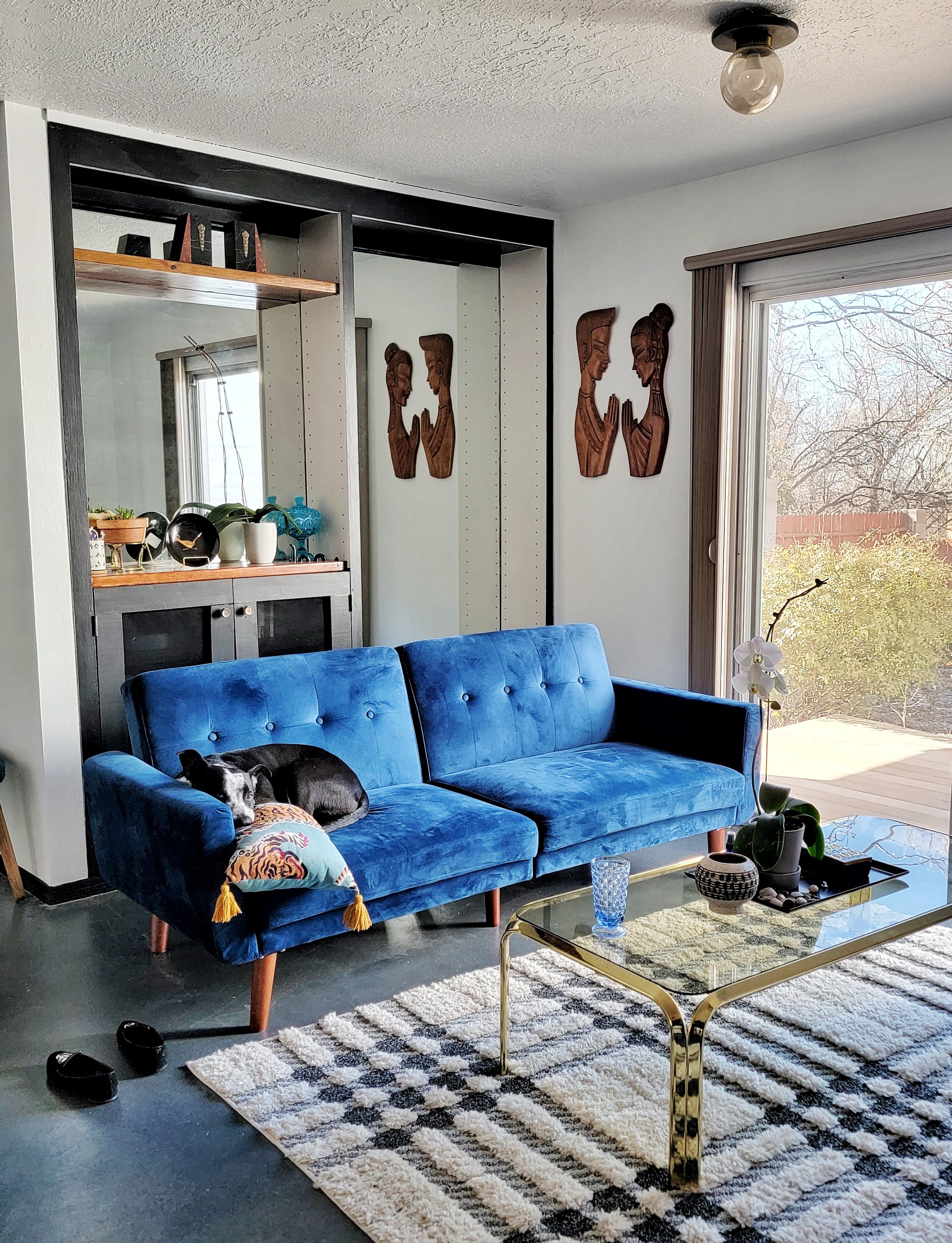
Another way to incorporate blue vintage decor into your home is to focus on smaller, more subtle details. For example, you could add vintage blue glassware to your kitchen or dining room. These pieces can add a touch of elegance and sophistication to a space, and can be a great way to complement other vintage decor.

When adding blue vintage decor to your home, it's important to keep in mind the overall style of your space. For example, if you have a more modern or contemporary decor style, it's best to stick to a few statement pieces or small details, rather than overwhelming the space with vintage decor. If you have a vintage inspired or time capsule home, there really is no limit. Our space at Roth Modern HQ is somewhere in-between. We have a some modern made repro statement pieces like sofas and desks but for the most part everything else is vintage.
In summary, adding blue vintage decor to your home can be a great way to bring a touch of nostalgia and character to your living space. Whether you focus on statement pieces or smaller, more subtle details, there are many ways to incorporate vintage decor into your home. Just make sure to keep in mind the overall style of your space when adding vintage decor. These suggestions apply for any color you may have in mind. We chose blue because we found that it was a rarer hue for the era we love (the 1960s and 70s) but we encourage you to go for whatever color heart desires.


The Comeback of Yellow and Brown in Mid-Century Home Decor

A Look at the Popularity of Warm Tones in the Swinging Sixties
Uncovering the cultural and societal influences behind a popular color trend
Vintage home decor lovers know the power of color to define an era—and in the mid-century modern movement, warm tones like yellow and brown played a starring role. These hues aren’t just colors; they’re cultural snapshots, deeply rooted in the social and design landscape of the 1960s and 70s. Today, these warm tones are enjoying a major revival, making a bold statement in modern interiors that blend nostalgia with contemporary style.
The 1960s were a decade of upheaval and transformation—socially, politically, and culturally. Yellow and brown glassware and home accents were everywhere, echoing the optimism, earthiness, and experimental spirit of the time. Yellow evoked sunshine, hope, and the carefree vibes of the Summer of Love and counterculture movements. It was a bright, cheerful symbol of peace, freedom, and possibility amid a world in flux. Brown rooted mid-century modern design in nature and simplicity. It reflected the growing appreciation for natural materials and warm, organic textures as a response to the machine age’s sterility. Together, these hues captured a perfect balance of youthful optimism and grounded practicality.
The popularity of yellow and brown in mid-century decor was about more than just aesthetics—it was a reflection of shifting values. The counterculture embraced bright, optimistic colors as a break from the gray uniformity of post-war life, while environmental awareness was rising and earthy browns connected interiors to the natural world. At the same time, innovations in glassmaking techniques and colorants made producing vibrant yellows and warm browns easier and more affordable, spreading these colors into countless households.
Fast-forward to the 2020s, and we’re seeing a fresh wave of interest in these warm vintage hues, especially a popular muted shade known as butter yellow. This softer yellow ties into today’s broader focus on sustainability, mindfulness, and cozy, lived-in spaces. Designers and collectors alike are drawn to yellow and brown for their ability to add warmth and personality without overwhelming a space, complement natural materials like wood, leather, and stone, and evoke a sense of timelessness and connection to the past—perfect for layering vintage with modern.
At CLAY+CODA, we celebrate how these colors allow vintage pieces to feel fresh again. Whether it’s a honey-hued glass vase or a walnut sideboard, these warm tones make every space a curated reflection of history and style. Styling these hues today means pairing butter yellow glassware or ceramics with neutral linens and greenery for balance, mixing deep brown wood furniture with lighter upholstery or metal accents to create dynamic contrast, and layering in textured fabrics like boucle or leather to enhance warmth and tactile richness. Using yellow as an accent through lighting, cushions, or decorative objects can inject energy into neutral rooms without overpowering them.
Choosing vintage yellow and brown decor isn’t just a design choice—it’s a sustainable one. Pieces from the 1960s and 70s were crafted with quality and longevity in mind, built to stand up to use and wear better than many contemporary mass-produced alternatives. By incorporating authentic vintage yellow and brown items into your home, you reduce demand for fast furniture and decor, embrace timeless design that ages gracefully, and connect your living space to the stories and craftsmanship of the past.
Yellow and brown aren’t just colors; they’re a warm, historic embrace that’s back with purpose. Whether you’re curating a full mid-century modern aesthetic or simply adding a few vintage accents, these hues bring depth, personality, and sustainable style to any home.
Discover a curated collection of vintage yellow and brown pieces at CLAY+CODA and elevate your space with authentic design that lasts.

The Science Behind the Blue Tint in Glass

Uncovering the Chemistry Behind the Stunning Blue Shades in Vintage Glassware
Blue vintage glassware captivates collectors and design enthusiasts alike with its rich, vibrant hues. But what exactly creates these stunning shades of blue? Understanding the chemistry behind blue glass reveals the artistry and craftsmanship involved in producing these timeless treasures.
How is Blue Glass Made?
The signature blue color in vintage glassware primarily comes from adding metal oxide compounds to molten glass during production. The most common is cobalt oxide, which yields a deep, intense blue prized in many collectible pieces. Alternatively, copper oxide can produce a softer, greenish-blue tone, adding variety to the blue spectrum.
Another sophisticated technique is cased glass, where a core of clear or colorless glass is encased in a colored glass layer. This method allows artisans to create layered blue hues with complex depth and luminosity, giving vintage glassware its unique character.
The Role of Fire and Flame
The type of flame used during the melting process also affects the final color. Variations like oxygen-enriched or reducing flames can subtly alter glass chemistry, influencing shade intensity and clarity. This meticulous control of heat and atmosphere speaks to the centuries-old expertise glassmakers employed to perfect their craft.
Why Does This Matter for Vintage Collectors and Enthusiasts?
Each piece of blue vintage glassware is not just a functional object but a work of art shaped by chemistry, technique, and history. Recognizing how these colors are achieved deepens appreciation for the skill behind every vintage bowl, vase, or goblet, making your collection truly one-of-a-kind.
Embrace Vintage Blue Glass for Sustainability and Style
Choosing vintage blue glassware adds more than just color to your home—it supports sustainable living by repurposing durable, quality pieces that have stood the test of time. These objects combine beauty and history, enriching your space with a story that modern mass-produced glass cannot match.

Why Vintage Glassware Belongs in Every Modern Home
Discover why vintage glassware is the ultimate sustainable addition to your home. Beyond its timeless style, vintage glassware offers unmatched durability and reduces environmental impact by cutting demand for new production. Learn how choosing vintage pieces not only elevates your decor with unique character but also supports eco-friendly living.
Why Vintage Glassware Is the Sustainable, Stylish Choice for Modern Living
In an era where sustainability and intentional design go hand in hand, vintage glassware offers more than just aesthetic value — it’s a conscious choice. Whether you're curating a shelf, setting a dinner table, or building a home with soul, vintage glass brings lasting beauty without the environmental cost of mass production.
The Case for Glass That’s Already Made
Every new object comes with a footprint — and glass is no exception. The production of new glass requires significant natural resources: sand, soda ash, limestone, and energy-intensive manufacturing. This process contributes to carbon emissions and ongoing resource depletion.
Choosing vintage glassware eliminates that impact. You're not asking the planet for anything new — you're choosing something that already exists. It’s a circular approach to consumption that values preservation over production.
Built to Last, Designed to Endure
Many vintage glass pieces were produced in an era when craftsmanship and durability were the default, not the exception. Whether it’s pressed glass from the Depression era, hand-cut crystal, or elegant mid-century tumblers, vintage glassware was made with care — and often with higher quality materials than what you’ll find on today’s shelves.
These pieces were built to be used — not just displayed — and their longevity proves it. With proper care, vintage glassware can serve beautifully for generations.
Style with Substance
There’s no substitute for the character that comes with age. From jewel-toned coupes to smoky amber tumblers, vintage glassware captures the design sensibilities of the eras it came from — 1930s Deco glam, 1950s hostess chic, or 1970s dinner party decadence. These pieces carry stories, and they invite you to create new ones.
Unlike mass-produced trends, vintage glassware stands out. It adds depth, history, and a layer of personal expression to your space — and no two collections are ever quite the same.
Tips for Buying Vintage Glassware
Inspect closely: Avoid cracks, deep scratches, or chips that may affect usability.
Research makers: Identifying the era or maker (like Blenko, Fostoria, or Libbey) can add value and context.
Buy what you’ll use: Whether it’s highball glasses for cocktails or cut-glass dessert dishes, choose pieces that suit your lifestyle.
The Bottom Line
Vintage glassware is more than a stylistic choice — it’s a sustainable design philosophy in action. By embracing what already exists, you're reducing waste, preserving quality, and investing in pieces that carry both history and integrity.
At CLAY+CODA, we believe good design is timeless — and vintage glassware proves it.